Scoring genre clarity...

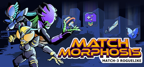
Match Morphosis: Match-3 Roguelike capsule

Match Morphosis: Match-3 Roguelike

A challenging roguelike match-3 deckbuilder. Defeat enemies by matching pieces and triggering their effects. Build your deck and unleash satisfying infinite combos. Play strategically and master your form in this unique turn-based Kamen Rider-inspired roguelike.

DeckbuildingRoguelikeRoguelite
Stochastic WalkComing soon

Match Morphosis: Match-3 Roguelike scores 70/100 — better than 25% of Deckbuilding capsules (n=951).

Released Coming soon · By Stochastic Walk

Quick text summary

Match Morphosis: Match-3 Roguelike scored 70/100 on Steam Analyzer — Good for a Deckbuilding capsule. Top priority fix: [uniqueness_polish] Integrate a signature visual motif (e.g., distinctive character marking, unique card back design, or iconic transformation effect) that immediately signals Match Morphosis brand identity.

Capsule scores by dimension

  • Genre Clarity: 7/10 — Clear match-3 with RPG/deck elements. The capsule signals match-3 through the visible gem icons and cards scattered in the lower half, while the large character silhouette on the left suggests RPG/action gameplay with potential transformation mechanics. At TINY size, the gems and cards remain identifiable, though the roguelike deck-building and transformation aspects require prior knowledge; the genre reads as casual puzzle-action rather than the deeper deckbuilder strategy it represents.
  • Title Readability: 8/10 — Bold orange title, strong legibility. MATCH MORPHOSIS is rendered in large, bright orange sans-serif text with a dark outline, positioned prominently in the upper-center region against a darker gradient background. The title remains clearly readable at SMALL and TINY sizes without collapse; spacing is clean and the outline prevents letter bleeding into the background.
  • Contrast & Color: 8/10 — Strong warm-cool separation, vibrant accent. The bright yellow-orange character and title pop strongly against the dark blue-purple gradient background, creating clear value separation even in grayscale. The gem icons below add colorful accent points that guide attention; however, the mid-tone character body could have slightly higher contrast with the background at TINY sizes.
  • Uniqueness & Polish: 6/10 — Competent but familiar match-3 treatment. The design executes the match-3 genre template competently with a transforming hero character and floating cards, but lacks a distinctive hook that sets it apart from other casual roguelikes in the benchmark set. The Kamen Rider inspiration is present in the character's design but not immediately obvious to unfamiliar audiences; gem and card assets feel standard rather than uniquely stylized.
  • Brand Consistency: 6/10 — Consistent color palette, weak identity signal. The warm orange-yellow palette and purple-blue background are applied consistently across the composition, and the transforming character appears to be a core brand identity element. However, without seeing the full 12-screenshot library, there is insufficient visual repetition of a memorable motif or signature art style that would make this capsule instantly recognizable as Match Morphosis specifically.
  • Composition: 7/10 — Clear focal point, balanced layout. The large character on the left acts as the primary focal point, while the title anchors the center-top, and the gem/card grid provides secondary visual interest in the lower half without overwhelming the design. At SMALL and TINY sizes, the hierarchy holds; however, elements approach the right edge somewhat closely and could benefit from additional breathing room to remain safe across all Steam crop scenarios.

What works

  • Title legibility and contrast. Bright orange bold typography with dark outline maintains readability across all viewing sizes, from full header to tiny thumbnail.
  • Clear visual hierarchy. Character silhouette commands immediate attention, title reinforces branding, and card/gem icons provide secondary layer without cluttering.
  • Strong color separation. Warm character and title stand out distinctly against cool blue-purple gradient, maintaining clarity even in grayscale contrast test.

What hurts the capsule

  • Generic match-3 visual language. Gem icons and floating cards follow familiar casual-game conventions without a distinctive stylistic twist that differentiates from competitor capsules.
  • Weak brand identity signal. The transformation/Kamen Rider mechanic is visually present but not prominent enough to create instant recognition or memorable brand recall.
  • Roguelike/deckbuilder aspects unclear. The match-3 and RPG elements are readable, but the core deck-building and roguelike progression systems are not visually communicated, potentially underselling the game's strategic depth.

Priority fixes

  1. [uniqueness_polish] Integrate a signature visual motif (e.g., distinctive character marking, unique card back design, or iconic transformation effect) that immediately signals Match Morphosis brand identity.
  2. [genre_clarity] Add a subtle deckbuilding or roguelike progression visual cue (e.g., a run meter, deck stack, or boss indicator) to clarify the strategic depth beyond match-3 mechanics.
  3. [composition] Increase right-edge margin safety and ensure no critical elements sit within 10% of capsule boundary to prevent Steam crop loss.

Store copy priority fixes

  1. [feature_communication] Add a sentence explaining one concrete synergy example: 'Match fire tiles to trigger a spell card that converts adjacent water tiles into ice, chaining bonus damage.' This proves the mechanic's depth.
  2. [hook_strength] Cut the cult narrative from the opening paragraph and replace with a gameplay-focused sentence: 'Master form-shifting: swap between 5 characters mid-run, each unlocking entirely different match patterns and deck strategies.'
  3. [uniqueness] Rewrite 'you've never seen before' to 'the only match-3 where your deck shapes the board itself—equip armaments that alter tile behaviour, adding chess-like tactical layers to classic cascades.'
  4. [tone_match] Reduce 'divine extinction' and similar lore weight; frontload 'cyberpunk insect-machine aesthetic' in detailed description to align with retro-anime tone set by Kamen Rider reference.

Related guides

Steam app ID: 4131100 · Tags: Deckbuilding, Roguelike, Roguelite, Cyberpunk, RPG