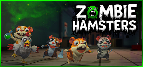
Scoring genre clarity...

Zombie Hamsters capsule

Zombie Hamsters

A 4-player cooperative online game. Escape from a scientific laboratory while playing as zombie hamsters and infect everyone around you.

ActionParty Game3D
Unigames LLPComing soon

Zombie Hamsters scores 77/100 — better than 68% of Party Game capsules (n=419).

Released Coming soon · By Unigames LLP

Quick text summary

Zombie Hamsters scored 77/100 on Steam Analyzer — Good for a Party Game capsule. Top priority fix: [composition] Add a secondary zombie hamster or infected character silhouette to hint at multiplayer cooperative gameplay and infection mechanic [highest impact for genre clarity]

Capsule scores by dimension

  • Genre Clarity: 8/10 — Zombie creature theme clearly readable. The left-side zombie hamster character with exaggerated teeth and yellowed eyes immediately signals a horror-comedy indie game. The green zombie head icon in the title reinforces the undead theme. At tiny size, the cartoonish zombie aesthetic and vibrant color separation still communicate 'creature-based indie game,' though the exact multiplayer cooperative angle is not visually apparent.
  • Title Readability: 8/10 — Bold white title legible at all sizes. The large sans-serif white 'ZOMBIE HAMSTERS' text with high contrast against the dark background and character elements is readable at full header and maintains strong legibility at small and tiny sizes. The integrated zombie head icon within the title adds visual interest without compromising letter clarity. The thick weight and clean spacing ensure the title does not collapse under squinting or grayscale conversion.
  • Contrast & Color: 8/10 — Strong value separation and vibrant character pop. The bright orange-yellow hamster on the left and lime-green zombie head create sharp chromatic separation from the dark background (#1b2838 equivalent). White text maintains excellent contrast throughout the composition. Grayscale evaluation confirms clear silhouettes; the character reads distinctly even at tiny sizes due to value separation from the blurred background.
  • Uniqueness & Polish: 7/10 — Polished indie aesthetic with comedic hook. The zombie hamster concept is playful and memorable, differentiating from serious horror or typical multiplayer mascots. Character rendering shows solid craft and detail work; the exaggerated expression and proportions communicate the game's tonal blend of horror and humor. The composition feels intentional rather than templated, though the dark silhouette background is a common indie design pattern.
  • Brand Consistency: 7/10 — Coherent cartoon horror identity. The bright, exaggerated character style, lime-green zombie accents, and playful-yet-creepy tone form a recognizable internal identity. The color palette (orange, green, white, dark) is distinctive and would be memorable across store screenshots. The approach is cohesive, though without iconic motifs or signature visual elements that would guarantee instant recognition across future game marketing.
  • Composition: 8/10 — Clear focal hierarchy with balanced layout. The zombie hamster anchors the left third as primary focal point, while the title occupies the center-right with the green zombie icon acting as a visual bridge. The dark blurred background recedes appropriately, creating clear depth layering. At small and tiny sizes, the character remains the dominant eye-draw while title readability persists; safe margins are respected and no critical elements risk Steam thumbnail cropping.

What works

  • Strong chromatic contrast. Orange and green characters pop sharply against the dark background and maintain silhouette clarity even at tiny sizes.
  • Readable title at all scales. Large white sans-serif text with integrated icon stays legible from full header down to thumbnail without losing letterform integrity.
  • Memorable character design. Exaggerated zombie hamster expression and proportions immediately signal playful horror tone and game personality.
  • Clear focal hierarchy. Character on left anchors attention while title occupies the visual center, creating balanced composition with natural eye flow.

What hurts the capsule

  • Generic dark blurred background. The out-of-focus dark silhouette backdrop is a common indie template that does not add unique visual storytelling or environmental context.
  • No multiplayer or gameplay hint. The capsule communicates 'zombie creature game' but does not visually suggest cooperative mechanics, infection mechanics, or the laboratory setting referenced in the description.
  • Limited iconic brand markers. While the character is appealing, there are no distinctive motifs, symbols, or signature visual elements that would guarantee recognition across unrelated store screenshots.

Priority fixes

  1. [composition] Add a secondary zombie hamster or infected character silhouette to hint at multiplayer cooperative gameplay and infection mechanic [highest impact for genre clarity]
  2. [uniqueness_polish] Replace or enhance the dark blurred background with a recognizable laboratory environment detail (machinery, glass, neon accent) to strengthen visual storytelling and differentiation [improves context and memory]
  3. [genre_clarity] Consider a subtle UI or gameplay element (crosshair, health bar, escape hatch outline) to reinforce the 'cooperative multiplayer escape' angle without cluttering [clarifies core mechanic]

Store copy priority fixes

  1. [feature_communication] Replace 'Unique abilities for each hamster' with a concrete example: e.g., 'Unique abilities—the Leader can turn staff into zombies faster, the Hacker disables traps, the Digger gnaws through walls' so players understand the ability system.
  2. [uniqueness] Add a sentence differentiating this game's core appeal from generic co-op games: e.g., 'Unlike traditional shooters, every physics object is a tool—combine hamster abilities and environmental destruction to solve puzzles or create chaos.'

Related guides

Steam app ID: 4132210 · Tags: Party Game, 3D, First-Person, Funny, Horror