Scoring genre clarity...
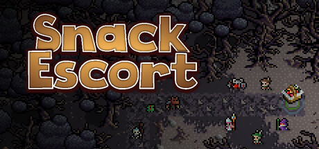
Who would’ve thought that a roguelike, card game, and tower defence could come together over a basket of food? Travel through magical lands filled with hungry creatures, collect cards and artifacts that shape your strategy with every run. Escort your food through this whimsical fantasy world.
$5.99Mixed(10)
Roguelike DeckbuilderTower DefenseCard Game
JuTek PixelMar 9, 2026