Scoring genre clarity...
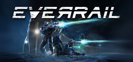
EverRail capsule

EverRail

A survival crafting adventure set in an infinite frozen world, where your train is your only refuge. Build and expand it into a moving fortress as you journey alone or with up to 8 players. Rescue survivors to stay alive, every loss costs a passenger. Stop for too long, and you risk losing it all.

Open World Survival CraftEarly AccessCrafting
Aesir InteractiveQ3 2026

EverRail scores 75/100 — better than 67% of Open World Survival Craft capsules (n=133).

Released Q3 2026 · By Aesir Interactive

Quick text summary

EverRail scored 75/100 on Steam Analyzer — Good for a Open World Survival Craft capsule. Top priority fix: [uniqueness_polish] Emphasize the train fortress visual prominence or add a UI/HUD element (cargo counter, passenger silhouettes, fuel gauge) to reinforce the crafting and survival-management mechanics and differentiate from standard action titles.

Capsule scores by dimension

  • Genre Clarity: 7/10 — Survival action with clear sci-fi setting. The frozen landscape, armed characters in tactical gear, glowing blue tech, and prominent train fortress immediately signal a sci-fi survival-action game with exploration elements. At tiny size, the icy environment and character silhouettes read as action-adventure, though the specific train-survival mechanic is not immediately obvious from visuals alone. The blue energy effects and snow setting effectively communicate a harsh, technological survival experience.
  • Title Readability: 8/10 — Strong legible title with clean placement. EVERRAIL is rendered in large, bold white sans-serif lettering positioned in the upper portion with a semi-transparent backing that ensures readability against the busy background. The title maintains clarity at small size due to generous spacing and high contrast white against the sky gradient. At tiny size, the text remains recognizable as a distinct word unit, though individual letterforms blur slightly—acceptable for a memorable brand name.
  • Contrast & Color: 8/10 — Excellent value separation and vibrant accents. The image leverages strong light-to-dark contrast: bright white sky and snow against dark silhouettes of characters and the blue train fortress, which pops with saturated cyan-blue glow effects. Against Steam's dark background (#1b2838), the snow-covered landscape and bright sky create immediate visual separation. In grayscale, the composition maintains clear silhouette definition, with the train structure and character forms reading distinctly without edge blend issues.
  • Uniqueness & Polish: 7/10 — Polished sci-fi aesthetic with specific mechanical hook. The capsule communicates a cohesive vision: a train-based survival fortress in a frozen wasteland, elevated by clean VFX work, purposeful lighting, and a deliberate color palette of cool blues and warm character highlights. The composition tells a story—characters interacting with the train, tech elements, and environmental danger—rather than a generic action scene. However, the visual style aligns with recognizable sci-fi-survival tropes, limiting distinctiveness within the action-adventure space, though the train mechanic is a clear differentiator.
  • Brand Consistency: 7/10 — Cohesive icy sci-fi aesthetic with iconic train. The train fortress is a consistent, recognizable visual anchor that could serve as a brand symbol across marketing materials. The cool-toned color palette (whites, blues, cyan accents) is applied uniformly across characters, environment, and tech effects, creating internal coherence. The style is consistent with a premium survival-action game, and the train element provides a distinctive identity cue, though without reference to the 11 screenshots provided, the full brand consistency claim cannot be validated comprehensively.
  • Composition: 8/10 — Strong focal hierarchy with balanced depth layering. The composition features clear foreground characters (left and center), midground train fortress (center-right), and background frozen landscape with mountains, creating effective depth. The title sits safely in the upper region, and the train is positioned as the visual anchor without dominating the frame. At small and tiny sizes, the eye naturally travels from character action to the train structure, maintaining clear hierarchy and readable focal points without scattered attention or edge-hugging elements.

What works

  • High contrast against dark Steam background. Bright whites and saturated blues stand out immediately against #1b2838, and silhouettes remain clean and readable even at tiny size.
  • Clear visual storytelling of core mechanic. The train fortress as a central, iconic element effectively communicates the unique survival-crafting hook and is memorable across viewing sizes.
  • Legible title placement with controlled background. EVERRAIL is positioned on a semi-transparent backing that ensures text clarity at all sizes without competing with the visual action below.
  • Balanced depth and focal hierarchy. Foreground characters, midground train, and background landscape create layered composition that guides attention without clutter or dead zones.

What hurts the capsule

  • Generic sci-fi survival visual language. While polished, the icy wasteland and armed-character aesthetic align with many sci-fi-action games, reducing distinctiveness compared to top-tier genre competitors.
  • Subtle train-specific survival mechanic visibility. At tiny size, viewers may perceive this as standard sci-fi action rather than immediately understanding the unique train-fortress-building survival premise without supporting context.
  • Limited character differentiation. The two armed figures in tactical suits read as generic action characters rather than communicating personality, role diversity, or emotional stakes inherent to a 4-player co-op survival game.

Priority fixes

  1. [uniqueness_polish] Emphasize the train fortress visual prominence or add a UI/HUD element (cargo counter, passenger silhouettes, fuel gauge) to reinforce the crafting and survival-management mechanics and differentiate from standard action titles.
  2. [genre_clarity] Consider adding a subtle passenger or survivor element (silhouette in train window, cargo container visual) to communicate the human-rescue narrative and distinguish this from pure combat-focused survival games.
  3. [brand_consistency] Develop a signature color accent or icon (e.g., a glowing rail motif, passenger counter badge, or train emblem) to create a memorable brand element that could anchor secondary marketing materials and ensure long-term visual recognition.

Store copy priority fixes

  1. [hook_strength] Replace 'And so much more!' with one concrete additional system (e.g., 'Season dynamic weather systems, anomaly encounters, and procedurally-seeded tech trees') to maintain credibility and specificity.
  2. [feature_communication] Add a brief sentence explaining the progression loop: how expeditions feed back into train upgrades and how survivor count gates access to new areas or systems.
  3. [uniqueness] After the detailed description, add 1-2 sentences explicitly contrasting EverRail to similar survival games (e.g., 'Unlike static base-builders, your home moves with you, forcing constant resource trade-offs between defense and mobility') to strengthen differentiation.
  4. [tone_match] Rewrite the closing from 'Time to join in Conductor!' to something that maintains the gravity of the setting while still being a call-to-action (e.g., 'The frozen world awaits. Will you survive?').

Related guides

Steam app ID: 4134600 · Tags: Open World Survival Craft, Early Access, Crafting, Singleplayer, Online Co-Op