Scoring genre clarity...
Scoring genre clarity...
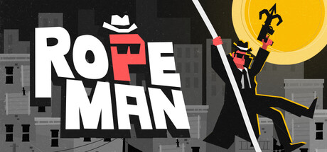
Ropeman scores 77/100 — better than 78% of Action capsules (n=9,073).
Positive (13 reviews) · $5.99 · Released May 25, 2026 · By 1K Project
Ropeman scored 77/100 on Steam Analyzer — Good for a Action capsule. Top priority fix: [uniqueness_polish] Add subtle environmental storytelling or iconic landmark detail to the cityscape to elevate visual distinctiveness beyond generic platformer backdrop.
Steam app ID: 4134680 · Tags: Action, Difficult, Psychological Horror, Singleplayer, Platformer