Scoring genre clarity...
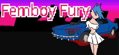
Femboy Fury is a demolition derby of high-octane proportions! Choose between 10 femboy characters and compete in an arcade like drive-and-shoot in semi-destructible environments! Franticly search for weapon pick-ups as you dodge enemies chasing you! Be the last femboy driving in 8 levels!
$0.991 user reviews
ActionCasualArcade
FzzyBzzyNov 20, 2025