Scoring genre clarity...

Stranded Without A Phone capsule

Stranded Without A Phone

Your space ship has crashed landed on a planet that is almost completely covered by ocean. You are the only survivor. Use your survival skills to stay alive long enough to get rescued.

$2.992 user reviews
SurvivalRPGCrafting
GilligamesNov 11, 2025

Stranded Without A Phone scores 70/100 — better than 32% of Survival capsules (n=1,799).

2 user reviews · $2.99 · Released Nov 11, 2025 · By Gilligames

Quick text summary

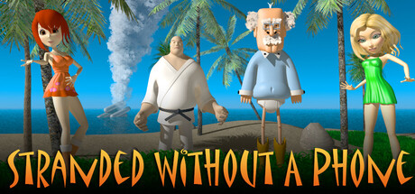
Stranded Without A Phone scored 70/100 on Steam Analyzer — Good for a Survival capsule. Top priority fix: [uniqueness_polish] Add a distinctive visual element or art style signature that differentiates from standard tropical survival games—consider unique lighting, weather effects, or character pose storytelling that communicates the 'phoneless' survival hook.

Capsule scores by dimension

  • Genre Clarity: 7/10 — Clear survival adventure with readable cast. The tropical island setting with palm trees, ocean horizon, and four character survivors immediately signal an adventure or survival game. At tiny size, the colorful cartoon characters and beach environment read as casual adventure rather than hardcore survival, which softens genre expectation but remains coherent. The visual style suggests lighthearted survival rather than grim wilderness mechanics.
  • Title Readability: 8/10 — Bold golden text reads well at all sizes. The title 'STRANDED WITHOUT A PHONE' uses a thick, warm golden-yellow font with strong contrast against the blue sky background and dark outline support. At small and tiny sizes, the text remains legible and maintains its playful tone. The positioning in the lower third provides stable ground and avoids character overlap that would obscure letters.
  • Contrast & Color: 8/10 — Vibrant palette with strong value separation. The bright turquoise ocean, clear blue sky, and golden title text create excellent separation against the Steam dark background. Character silhouettes pop clearly with distinct clothing colors (red, white, blue, green), and the warm golden text contrasts sharply with cool background tones. Even at tiny size, the overall color block composition remains distinct and readable.
  • Uniqueness & Polish: 6/10 — Competent but familiar survival adventure aesthetic. The casual 3D character models and tropical setting are well-executed but align with common adventure game visual language seen in indie titles. The 'phone-free stranded' concept is communicated visually through isolated characters and island setting, but the execution feels like a standard survival game presentation without a distinctive visual hook or memorable art direction. Polish is solid but not premium compared to top benchmarks like DREDGE or Chants of Sennaar.
  • Brand Consistency: 6/10 — Coherent but generic character and world design. The four distinct characters (red-haired woman, blonde woman, tan man in blue, man in white) show internal consistency in art style and coloring approach, creating a recognizable cast. However, there are no signature visual motifs, iconic symbols, or distinctive palette choices that signal a memorable brand identity beyond 'tropical survival game.' The presentation feels competent but interchangeable with similar indie adventure titles.
  • Composition: 7/10 — Clear focal arrangement with stable hierarchy. The four characters are distributed across the horizontal frame with roughly balanced weight, creating a readable ensemble cast at small sizes. The ocean and sky layering provides depth, and the title placement at bottom anchors the composition. At tiny size, individual character details blur but the silhouette group and title remain distinct, though character faces lose definition.

What works

  • Strong title legibility. Golden outlined text reads clearly at all viewing sizes and maintains playful tone through bold, warm coloring.
  • Vibrant color contrast. Turquoise, blue, and golden palette separates decisively from Steam dark background and survives squint and grayscale tests.
  • Clear ensemble composition. Four characters arranged for balanced focal weight prevent attention scatter and read as a cohesive survivor group.

What hurts the capsule

  • Generic survival game presentation. Tropical island setting and colorful characters follow familiar indie adventure template without distinctive visual storytelling or unique hook.
  • Limited brand identity signals. No iconic character, signature symbol, or memorable visual motif that would create recognition on repeat exposure or in a crowded storefront.
  • Facial detail loss at tiny size. Character face features and expressions become indistinct at thumbnail viewing, reducing personality and connection impact.

Priority fixes

  1. [uniqueness_polish] Add a distinctive visual element or art style signature that differentiates from standard tropical survival games—consider unique lighting, weather effects, or character pose storytelling that communicates the 'phoneless' survival hook.
  2. [brand_consistency] Develop a signature visual motif or iconic symbol that ties the game identity together and becomes recognizable across marketing—consider a unique UI element, visual effect, or character accessory repeated in store screenshots.
  3. [composition] Enhance character silhouette distinctiveness at tiny size by adjusting pose variety or adding foreground props that reinforce survival theme and maintain recognizability at thumbnail scale.

Store copy priority fixes

  1. [hook_strength] Replace 'use your survival skills to stay alive' with a specific danger or mystery hook—e.g., 'Survive on an alien ocean world where the tides hide ancient secrets' or 'Every night, something hunts in the dark. Will you live long enough to call for rescue?'
  2. [uniqueness] Add a sentence early in the detailed description explaining what 'Space HoRSE universe' means and how it differentiates this game—is it a shared-world experience, lore-rich setting, or crossover? Give players a reason this survival game is special.
  3. [feature_communication] Replace 'create other items using various combinations' with concrete examples—e.g., 'Craft tools from salvage: combine rope and wood to build fishing traps, or gather plants to brew medicine'—to clarify crafting depth.
  4. [tone_match] Rewrite the opening paragraph to match the survival atmosphere: replace corporate tone with vivid, grounded language that puts players in the survivor's headspace—e.g., 'The ocean has swallowed your crew. Now you cling to wreckage on an alien shore, racing against hunger, weather, and nightfall.'

Related guides

Steam app ID: 4135250 · Tags: Survival, RPG, Crafting, Adventure, Isometric