Scoring genre clarity...

The King of Assassins - The Kingdom capsule

The King of Assassins - The Kingdom

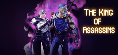
An action RPG combat game featuring two gameplay modes: Story Mode and Arena Mode. Engage in battles against enemies, bosses, and their allies, complete challenging missions, face relentless waves and storms of adversaries, and undertake various challenges to reclaim your kingdom. Enjoy! the game

$1.193 user reviews
ActionAdventureRPG
Faith Studio Team, Rabie Mounther HaddadJan 12, 2026

The King of Assassins - The Kingdom scores 60/100 — better than 0% of Action capsules (n=8,535).

3 user reviews · $1.19 · Released Jan 12, 2026 · By Faith Studio Team

Quick text summary

The King of Assassins - The Kingdom scored 60/100 on Steam Analyzer — Solid for a Action capsule. Top priority fix: [title_readability] Replace serif font with a bold sans-serif or decorative typeface with thicker strokes that maintains legibility at 120x45 resolution without loss of detail.

Capsule scores by dimension

  • Genre Clarity: 7/10 — Clear action RPG with dual character focus. Two armored figures in dynamic combat poses against purple magical effects immediately signal action RPG gameplay. The ornate armor, magical aura, and aggressive stances clearly communicate fantasy action combat, though the dual-character presentation is slightly ambiguous about whether this is co-op, a character select, or story mode pairing. At tiny size, the silhouettes and glowing effects remain readable enough to identify the genre as action-focused fantasy RPG.
  • Title Readability: 6/10 — Gold serif text readable but cramped at tiny. The title 'THE KING OF ASSASSINS' uses a gold serif font positioned in the upper right with solid contrast against the dark background. The text is legible at full size but begins to compress and lose character definition at tiny sizes, and the subtitle positioning adds cognitive load during quick scrolls. Strategic placement on a cleaner background region helps, but the serif font's delicate strokes struggle at 120x45 resolution.
  • Contrast & Color: 7/10 — Strong purple glow with solid figure separation. The vibrant magenta-purple particle effects create strong value separation from the dark background, and the figures' metallic armor catches light with good silhouette clarity. The grayscale squint test shows clear separation between characters and background, though the mid-tone armor blends slightly into the purple glow in some regions. At tiny size, the overall brightness and color saturation still read as a cohesive bright focal point.
  • Uniqueness & Polish: 5/10 — Competent but familiar action RPG aesthetic. The dual-character pose and purple magical effects follow standard action RPG visual language seen in many fantasy games, with clean execution but limited distinctive hooks. The armor design and particle effects are professionally rendered but do not communicate a unique mechanical angle or visual identity that distinguishes this title from comparable genre entries. The presentation is solid craftsmanship without a memorable or standout selling point that would make it stick in a crowded genre space.
  • Brand Consistency: 5/10 — Generic fantasy aesthetic lacks identity signals. The purple magical theme, ornate armor, and dual-character composition follow established fantasy action game conventions without introducing recognizable motifs or signature visual elements that would establish brand identity. No distinctive color palette, character silhouettes, or design language emerges that could be recognized across marketing materials or screenshots. While internally cohesive in rendering style, the capsule presents archetypal visuals rather than a memorable brand presence.
  • Composition: 6/10 — Centered characters with right-aligned title balance. The two armored figures occupy the center-left focal point with the title positioned upper right, creating basic compositional balance without strong depth layering. The background consists of a flat dark gradient with purple particle effects that fill space adequately but do not establish clear foreground, midground, and background separation. Safe margins appear present, and the layout should survive Steam's typical edge cropping, though the title placement at the edge introduces minor risk at small sizes.

What works

  • Strong contrast and silhouette readability. Purple glow effects and metallic armor maintain clear separation from the dark Steam background even at tiny sizes, ensuring immediate visual impact during quick scrolls.
  • Professional rendering quality. Clean character modeling, particle effects, and lighting are executed with competent polish that feels production-ready and avoids cheap asset appearance.
  • Clear action RPG genre communication. Dynamic combat poses, magical effects, and fantasy armor immediately signal the action-adventure genre to viewers regardless of size.

What hurts the capsule

  • Generic visual identity and theming. The purple magical warrior aesthetic is archetypal and widely used across action RPGs, offering no distinctive motifs or unique visual hooks that build brand recognition.
  • Title serif font struggles at small sizes. The gold serif lettering loses character definition and readability below small capsule size due to delicate stroke weight, harming discoverability in thumbnail view.
  • Limited compositional depth and layering. The flat background gradient with scattered particles lacks clear foreground-to-background spatial separation, resulting in a somewhat shallow visual hierarchy.
  • Ambiguous dual-character narrative. The two-figure composition does not clearly communicate whether this represents co-op gameplay, a story mode pairing, character select, or dual-protagonist mechanics.

Priority fixes

  1. [title_readability] Replace serif font with a bold sans-serif or decorative typeface with thicker strokes that maintains legibility at 120x45 resolution without loss of detail.
  2. [uniqueness_polish] Introduce a signature visual motif, unique color accent, or distinctive design element that differentiates this title's brand from standard fantasy action RPGs and builds recognition across marketing.
  3. [composition] Add a clear background environment or layered depth structure (foreground object, atmospheric separation) that creates visual storytelling and reduces the flat gradient appearance.
  4. [genre_clarity] Subtly clarify the relationship between the two characters through pose, positioning, or environmental context to reduce ambiguity about gameplay mode and core mechanic.

Store copy priority fixes

  1. [hook_strength] Rewrite the short description to lead with an emotional hook or a specific core conflict: 'A dethroned king returns for vengeance in this Souls-like action RPG. Master combat skills through intense training, then face relentless enemies and formidable bosses across two distinct gameplay modes.' This replaces the mechanical opening and awkward closing.
  2. [uniqueness] Add a sentence explaining the tactical or strategic layer that differentiates this game: 'Combine dynamic combat abilities with tactical positioning to overcome waves of coordinated enemies' or similar, to justify the 'Tactical RPG' tag.
  3. [feature_communication] Restructure the abilities paragraph with bullet points or a clearer sequence: Lead with 'Master a dynamic combat arsenal including ground/air dashes, light and heavy attacks, weapon styles, and environmental climbing' to show player agency and progression clarity.
  4. [tone_match] Revise formal procedural language to match the cinematic, dramatic tone of the game: Replace 'Players progress through the game by completing missions, ultimately advancing the storyline' with 'Chase your enemy across brutal landscapes, master devastating combat techniques, and reclaim your throne through conquest.'

Related guides

Steam app ID: 4136270 · Tags: Action, Adventure, RPG, Action RPG, Action-Adventure