Piggy Food Run scores 70/100 — better than 28% of Racing capsules (n=762).

Quick text summary

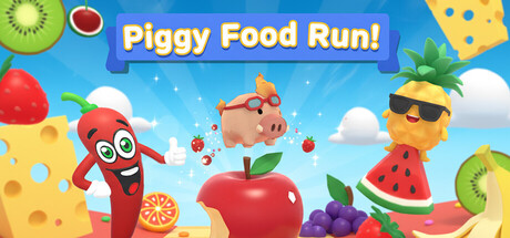
Piggy Food Run scored 70/100 on Steam Analyzer — Good for a Racing capsule. Top priority fix: [uniqueness_polish] Add a distinctive visual hook or stylistic element that sets this apart from generic casual platformers—consider a unique character expression, signature effect, or art style element.

Capsule scores by dimension

  • Genre Clarity: 7/10 — Clear casual platformer with food theme. The capsule immediately communicates a colorful casual platformer through the bright fruit-themed assets, cheerful pig protagonist, and playful food visuals scattered throughout. At tiny size, the central pig character and surrounding fruits remain readable enough to suggest a food-collecting platformer, though the racing aspect is not immediately obvious from visuals alone.
  • Title Readability: 8/10 — Bold white title with strong contrast. The title 'Piggy Food Run!' uses large white outlined letterforms centered prominently against a blue sky background, ensuring excellent readability at all sizes including tiny thumbnails. The exclamation mark adds energy, and the placement on a clear background area prevents obscuring by game assets, maintaining legibility even during quick scroll.
  • Contrast & Color: 8/10 — Vibrant palette with excellent value separation. The design uses saturated primary colors (red apple, orange pineapple, bright yellow cheese) that create strong contrast against both the blue sky midground and the Steam dark background. The white title further reinforces silhouette clarity, and the overall bright, cheerful palette maintains clear element separation even at tiny size through distinct hue and luminosity differences.
  • Uniqueness & Polish: 6/10 — Competent but visually generic casual style. The capsule displays clean, professional 3D renders of fruit and the pig character with polished lighting and smooth gradients, but the visual approach follows a familiar template for casual mobile-style games without distinctive art direction. While well-executed technically, it lacks a memorable visual hook or unique narrative element that would make it stand out among dozens of similar cheerful platformers in the market.
  • Brand Consistency: 6/10 — Coherent food-themed palette, limited identity. The capsule maintains internal consistency through unified fruit and food iconography, a cohesive warm-to-cool color scheme, and the recurring pig character as a recognizable mascot across visual elements. However, there are no distinctive brand markers, signature effects, or unique style cues that would make this instantly identifiable separate from other casual platformers sharing similar fruit-based aesthetics.
  • Composition: 7/10 — Clear hierarchy with centered focal point. The pig character sits as the clear primary focal point in the center, with fruit elements radiating outward to create depth and guide the eye naturally through the composition. The title placement above and the balanced distribution of assets prevent clutter, and key elements maintain safe margins; at tiny size the central pig remains prominent and the overall layout reads cleanly without collapsing.

What works

  • Strong title contrast and readability. White outlined text on blue background maintains legibility at all viewing sizes including thumbnail scale.
  • Vibrant color palette creates visual appeal. Saturated fruit colors with distinct hues separate clearly from the Steam dark background and each other.
  • Clear focal point hierarchy. Central pig character immediately draws attention while supporting fruit assets guide composition without competing for focus.

What hurts the capsule

  • Generic casual platformer presentation. Follows a familiar template with standard 3D fruit renders and bright cartoony style that resembles many mobile platformers without distinctive visual identity.
  • Limited brand differentiation markers. No signature art style, unique character design, or visual motifs that would make the capsule recognizable outside of its immediate context.
  • Racing element not visually evident. The 'Race' aspect of 'Food Run' is not communicated through visual cues like motion lines, competitive layout, or speed indicators.

Priority fixes

  1. [uniqueness_polish] Add a distinctive visual hook or stylistic element that sets this apart from generic casual platformers—consider a unique character expression, signature effect, or art style element.
  2. [genre_clarity] Incorporate subtle motion or racing visual cues (speed lines, competitive framing, or dynamic positioning) to clarify the racing/platforming hybrid nature at small sizes.
  3. [brand_consistency] Introduce a consistent signature visual motif or palette variation that becomes the game's memorable brand marker across all promotional materials.

Store copy priority fixes

  1. [hook_strength] Rewrite the short description to lead with an action-driven hook (e.g., 'Race through fruit-filled obstacle courses with up to 7 friends—solo or co-op') rather than stating the genre and player count first.
  2. [uniqueness] Add 1–2 sentences in the detailed description that explain what makes the level design or obstacles unique (e.g., destructible fruit, motion-based challenges, dynamic paths) or a specific selling point that differentiates from other platformers.
  3. [feature_communication] Expand the detailed description to include concrete details: number of levels, difficulty modes, visual theme, or example obstacle types so players understand the scope and gameplay loop.
  4. [audience_targeting] Clarify whether this is designed as a casual couch co-op party game or a challenge-focused platformer, so the right audience self-selects immediately.

Related guides

Steam app ID: 4137630 · Tags: Racing, Runner, Casual, Parkour, PvE