Scoring genre clarity...

HANDOVER capsule

HANDOVER

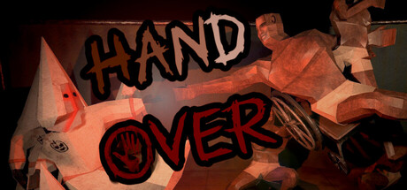
Wake up handless in an abandoned hospital and fight through a deranged cult to reclaim your missing hand and rescue prisoners. A dark comedy first-person brawler where every move hurts, literally. Sneak smart or strike hard, it's up to you.

$2.994 user reviews
Boomer ShooterFPSBeat 'em up
Jolly FoxNov 21, 2025

HANDOVER scores 65/100 — better than 13% of Boomer Shooter capsules (n=263).

4 user reviews · $2.99 · Released Nov 21, 2025 · By Jolly Fox

Quick text summary

HANDOVER scored 65/100 on Steam Analyzer — Solid for a Boomer Shooter capsule. Top priority fix: [title_readability] Add a semi-transparent dark backing panel behind the title text to guarantee readability at TINY size and prevent overlap with the character figure.

Capsule scores by dimension

  • Genre Clarity: 7/10 — Action brawler identity clear. The fragmented, aggressive character pose and glowing red hand iconography immediately signal an action game with dark, surreal theming. The dynamic limb positioning and intensity of the visual communicate combat-focused gameplay effectively. At TINY size, the silhouette and red hand motif remain recognizable, though the specific 'handless' mechanic isn't obvious without context.
  • Title Readability: 6/10 — Bold text, adequate at small. The title uses strong black sans-serif letterforms with red outlining that create decent separation from the warm orange background. At SMALL size the text reads acceptably, but at TINY size the fine red outline degrades slightly and letterform clarity diminishes. The two-line stacked layout ('HAND' / 'OVER') is functional but not optimally placed—it floats in the upper-left without a solid backing panel.
  • Contrast & Color: 7/10 — Warm palette pops well. The orange and red color scheme creates strong warm-to-cool separation against the default Steam dark background (#1b2838), with the glowing hand and character silhouette reading clearly even at reduced sizes. The mid-tone flesh and orange lighting dominate prime space, maintaining silhouette clarity in grayscale. However, some interior face details and costume specifics blur together in low contrast at TINY zoom.
  • Uniqueness & Polish: 6/10 — Competent but familiar execution. The low-poly geometric character model and hand-focused visual hook align with the game's core mechanic, showing intentional design thought. The warm lighting and slightly cartoonish 3D rendering feel polished but sit within a well-trodden indie action aesthetic that resembles stylized indie brawlers and horror-comedies. The execution is clean and craft-forward, but the overall look doesn't immediately distinguish itself from peers like Lies of P or other action-horror hybrids.
  • Brand Consistency: 6/10 — Thematic but light on identity. The visual consistently uses the character's aggressive pose and the central red hand motif as recurring elements that should map to in-game imagery and marketing. The warm orange-brown palette feels deliberate and unified across the composition. However, without access to the store screenshots, it's unclear whether this represents a strong, instantly-recognizable brand voice or merely competent thematic consistency—the design lacks an iconic character landmark or signature visual that stands alone.
  • Composition: 7/10 — Clear focal point, good hierarchy. The character's central limbs and the glowing red hand create a strong primary focal point that draws the eye immediately, with the title text anchoring the upper-left quadrant in supporting role. Depth layering (background fog, mid-ground character, foreground hand glow) adds dimensionality and prevents flatness. At SMALL and TINY sizes the composition holds together well, though the title placement in the corner risks being slightly de-emphasized compared to the figure.

What works

  • Strong warm-color separation. Orange and red tones create excellent silhouette clarity and pop against the Steam dark background across all viewing sizes.
  • Memorable core-mechanic visual. The glowing red hand positioned centrally communicates the handless/hand-reclamation premise immediately and ties directly to gameplay.
  • Solid depth and layering. Background fog, character figure, and foreground glow create visual dimension that reads clearly even when scaled down.
  • Clear action-game silhouette. The aggressive character pose and dynamic limb positioning signal combat intent without needing text explanation.

What hurts the capsule

  • Title placement risks marginalization. The upper-left text positioning is secondary to the central character, meaning at small sizes scrolling eyes may catch the figure first and miss the title entirely.
  • Red outline degrades at tiny zoom. The fine red text outline loses definition and clarity below ~120px width, reducing readability in thumbnail mode.
  • Generic indie-action aesthetic. The low-poly 3D render and warm lighting style closely resemble multiple competing action-horror games, limiting distinctiveness from similar-tier peers.
  • No solid title backing. The title floats directly over the noisy character and background gradient without a dark panel or legibility aid, creating potential readability risk.

Priority fixes

  1. [title_readability] Add a semi-transparent dark backing panel behind the title text to guarantee readability at TINY size and prevent overlap with the character figure.
  2. [composition] Consider repositioning the title to the lower-left or using a centered top banner layout to balance the composition and prevent the text from being visually dominated by the central character.
  3. [uniqueness_polish] Introduce a distinctive visual motif or color accent (signature glow effect, unique UI element, or iconic prop) that differentiates the capsule from similar indie action-horror competitors in quick-scroll browsing.
  4. [title_readability] Thicken or simplify the red text outline to prevent fine-detail loss at scales below 150px width, ensuring TINY thumbnail legibility.

Store copy priority fixes

  1. [feature_communication] Expand the pulse system explanation to clarify how morphine syringes work mechanically—do they reset pulse, slow its rise, or provide a temporary safety buffer?
  2. [feature_communication] Add a sentence explaining how stealth and combat paths differ in practice—e.g., 'Sneak past guards to avoid pulse spikes, or engage directly for faster objectives but higher risk.'
  3. [audience_targeting] Clarify the difficulty and intended player skill level—is this a hardcore challenge-run game, a casual comedy experience, or somewhere in between?

Related guides

Steam app ID: 4137700 · Tags: Boomer Shooter, FPS, Beat 'em up, 3D, Action