Scoring genre clarity...

The Curse Of Grandfather capsule

The Curse Of Grandfather

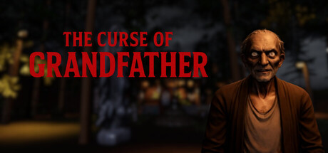
You are trapped in your grandfather's house on a dark night. You can whisper into your microphone or stay silent; every sound affects the creature. Solve puzzles, unlock hidden rooms, and find the keys to try to escape.

$1.992 user reviews
AdventurePuzzlePuzzle Platformer
MED GameNov 17, 2025

The Curse Of Grandfather scores 70/100 — better than 33% of Adventure capsules (n=7,922).

2 user reviews · $1.99 · Released Nov 17, 2025 · By MED Game

Quick text summary

The Curse Of Grandfather scored 70/100 on Steam Analyzer — Good for a Adventure capsule. Top priority fix: [uniqueness_polish] Add a subtle visual element that hints at the microphone mechanic—consider a faint sound wave, ambient audio visualization, or visual cue suggesting the player's agency through sound.

Capsule scores by dimension

  • Genre Clarity: 7/10 — Horror adventure with puzzle elements. The elderly grandfather character in brown clothing against a dark, moody interior clearly signals a horror or dark adventure premise. The dimly lit domestic setting and the character's haunted expression communicate psychological dread rather than action gameplay, though at tiny size the genre reads as dark mystery rather than specifically audio-mechanic puzzle game. The microphone-mechanic core concept is not visually communicated and would require external context to understand.
  • Title Readability: 8/10 — Clear red title with strong contrast. The red sans-serif typography at the top left reads cleanly in full size with excellent contrast against the dark background. At small and tiny sizes, the stacked 'THE CURSE OF / GRANDFATHER' layout maintains legibility due to the bold red color and adequate letter spacing. Minor weakness is that the title occupies only the upper third of the horizontal space, creating asymmetry, but contrast remains high enough that the text survives squinting and quick scrolling.
  • Contrast & Color: 8/10 — Strong value separation with warm tones. The red title pops decisively against the dark blue-black background (#1b2838), and the grandfather's warm brown clothing creates clear silhouette separation from the cool-toned shadows and blurred building behind him. In grayscale, the mid-to-light skin tones and brown jacket contrast well with the dark surroundings, and the red text reads as distinct light gray at tiny size. The overall lighting hierarchy keeps the subject readable even at thumbnail scale.
  • Uniqueness & Polish: 6/10 — Competent atmospheric scene, generic framing. The image presents a well-lit character study with clear emotion and professional lighting, but the composition—elderly person standing alone in dim surroundings—is a familiar trope in indie horror. There are no distinctive visual hooks that signal a unique mechanic (microphone control, silence-based stealth) or standout art direction; it reads as a moody character portrait rather than a game with a specific core identity. Compared to top peers like DREDGE (distinctive creature design) or Slay the Princess (striking visual motifs), this feels more generic in its approach.
  • Brand Consistency: 6/10 — Dark tone consistent, no iconic motifs. The color palette, lighting style, and character treatment are internally coherent and suggest a narrative-driven horror experience, but there are no memorable brand identity cues—no signature symbol, recurring visual motif, or distinctive character mark that would be recognizable across other marketing materials. The grandfather character could theoretically become iconic with consistent use, but this single image lacks the visual distinctiveness or signature style needed for strong brand recognition.
  • Composition: 7/10 — Clear focal point, asymmetrical layout. The grandfather is positioned slightly right of center and is the clear primary subject, with the blurred interior environment providing atmospheric context without competing for attention. The title anchors the upper left, leaving the grandfather dominant in the right two-thirds of the frame. At tiny size, the character silhouette and red text remain distinct with good hierarchy, though the overall composition feels slightly unbalanced—the left side is text-heavy while the right side is character-heavy, which works but lacks the polish of better-integrated layouts.

What works

  • Strong title contrast and legibility. The bold red sans-serif text maintains excellent readability across full, small, and tiny sizes against the dark background.
  • Clear emotional focal point. The grandfather's expression and front-facing pose create immediate visual interest and establish a psychological horror tone.
  • Professional lighting and depth. The warm key light on the character and cool ambient background create clear silhouette separation and a polished cinematic feel.

What hurts the capsule

  • Generic horror-character aesthetic. The elderly person in dim lighting is a familiar indie horror visual that does not differentiate this game from similar titles in the genre.
  • No mechanic visual communication. The microphone-control and sound-sensitivity core mechanics are completely invisible in the imagery, offering no hint of gameplay uniqueness.
  • Asymmetrical composition balance. The heavy text load on the left and character-only emphasis on the right creates a slightly off-balance spatial hierarchy.

Priority fixes

  1. [uniqueness_polish] Add a subtle visual element that hints at the microphone mechanic—consider a faint sound wave, ambient audio visualization, or visual cue suggesting the player's agency through sound.
  2. [brand_consistency] Introduce a signature visual motif or symbol unique to the grandfather or the house that could become a recognizable brand marker across all marketing.
  3. [composition] Reposition or rebalance the title and character to achieve more integrated, symmetrical composition while maintaining the atmospheric mood.

Store copy priority fixes

  1. [feature_communication] Expand the microphone feature description: clarify when and how the player's voice matters—e.g., 'Speak or whisper to alert the entity; stay silent to avoid detection' or similar concrete interaction rules.
  2. [audience_targeting] Add a sentence addressing difficulty and player type: specify if this is for horror veterans, casual players, or accessibility-focused players, and reconcile the 'intense' tone with the accessibility-first categories.
  3. [feature_communication] Replace 'Paranormal events and exploration-focused gameplay' with a specific example of a puzzle or interaction: e.g., 'Solve environmental puzzles to unlock sealed doors while an entity hunts you through the house.'

Related guides

Steam app ID: 4137730 · Tags: Adventure, Puzzle, Puzzle Platformer, Hidden Object, 3D