Scoring genre clarity...

Snägäri Pinball capsule

Snägäri Pinball

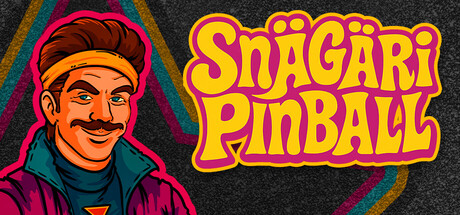
90s-style 2D pinball game celebrating Finland’s legendary late-night snack kiosks where neon lights, grease, and glory meet under the silver ball. Flip hard, eat sausage, and chase the highest score. It's the true Snägäri way. One table, multiple weird modes, themes, leaderboards plus kid-safe mode.

$7.992 user reviews
PinballArcadeParty Game
OwlkeepFeb 26, 2026

Snägäri Pinball scores 88/100 — better than 98% of Pinball capsules (n=52).

2 user reviews · $7.99 · Released Feb 26, 2026 · By Owlkeep

Quick text summary

Snägäri Pinball scored 88/100 on Steam Analyzer — Excellent for a Pinball capsule. Top priority fix: [composition] Consider adding a subtle pinball or flippers element in the background to reinforce gameplay mechanics and add visual depth.

Capsule scores by dimension

  • Genre Clarity: 9/10 — Clear pinball casual identity. The character in a snack kiosk headband, retro 90s art style, and bold yellow/red pinball-themed typography immediately signal a casual, nostalgic arcade experience. Even at tiny size, the distinctive character silhouette and vibrant neon aesthetic clearly communicate retro pinball gaming. The specific Finnish cultural hook (snägäri kiosk worker) adds memorable genre specificity beyond generic pinball.
  • Title Readability: 9/10 — Excellent bold retro typography. The 'Snägäri Pinball' title uses thick, chunky yellow letters with orange/red outline and shadow effects that maintain crisp legibility across full, small, and tiny sizes. The strategic right-side placement on a clean background avoids texture interference. At tiny size the letterforms remain distinct and the word breaks remain recognizable due to strong shape contrast and spacing.
  • Contrast & Color: 9/10 — Strong neon pop against dark. Bright yellow and hot pink title and character elements create excellent value separation against the dark charcoal background. The warm orange/magenta character and teal/rainbow gradient accent on the left side further strengthen the silhouette and visual pop. Even in grayscale, the character and title maintain clear edge definition and the lights/darks read distinctly at all sizes.
  • Uniqueness & Polish: 9/10 — Premium retro craft distinctive. The hand-drawn character style, consistent bold outlines, and confident color choices demonstrate strong artistic craft that avoids generic asset templates. The Finnish cultural specificity (snägäri kiosk worker with headband) and cohesive 90s arcade aesthetic create a unique selling point and memorable identity. The illustration quality and intentional effects (neon glow, shadow work) signal premium indie polish.
  • Brand Consistency: 8/10 — Strong iconic character motif. The character design establishes a clear, recognizable brand identity that could be spotted in store screenshots or marketing. The consistent bold outline style, color palette (warm earth tones with neon accents), and confident retro art direction suggest strong internal cohesion. The neon gradient detail and character expression create memorable visual hooks, though without seeing store screenshots full consistency cannot be rated 9.
  • Composition: 9/10 — Balanced character title hierarchy. The character occupies the left third as a clear focal point while the title anchors the right side, creating strong visual balance and clear hierarchy that works at all sizes. The character drawing guides attention naturally, and the title placement avoids overlap and dead space. At tiny size, both elements remain distinct without competing; the composition remains legible with safe margins respected.

What works

  • Vibrant neon color palette. Hot pink, yellow, and orange create immediate pop and energy against the dark Steam background, signaling a fun, arcade-ready aesthetic.
  • Readable title at all sizes. Thick, well-spaced lettering with outline shadow maintains clarity from full header down to tiny thumbnail without collapse.
  • Distinctive character branding. The headband-wearing snack vendor illustration is unique and memorable, supporting instant brand recognition and cultural specificity.
  • Clear focal point hierarchy. Character and title are spatially separated and balanced, creating a natural read flow that works across all viewport sizes.

What hurts the capsule

  • Limited background texture variety. The speckled dark background is functional but somewhat plain and generic, lacking additional depth or thematic context cues.
  • No gameplay mechanic hints. While the pinball genre is clear from typography, there are no visual references to actual pinball mechanics, ball, or table elements visible.

Priority fixes

  1. [composition] Consider adding a subtle pinball or flippers element in the background to reinforce gameplay mechanics and add visual depth.
  2. [uniqueness_polish] Introduce a faint snack kiosk environment detail (signage, counter edge) to enhance the Finnish snägäri setting narrative.

Store copy priority fixes

  1. [hook_strength] Add a one-sentence definition of 'snägäri' in the short description (e.g., 'Finland's legendary late-night snack kiosks – where the real decisions happen at 3:30 a.m.') to ground non-Finnish players immediately.
  2. [feature_communication] Move the '2 to 5 minute game length' expectation into the short description or the opening of the detailed description so casual players understand pacing before diving into modes.
  3. [uniqueness] Add a sentence comparing this to other pinball games (e.g., 'A single obsessively detailed table beats bloated 3D pinball with shallow breadth') to sharpen differentiation from competitors.

Related guides

Steam app ID: 4138430 · Tags: Pinball, Arcade, Party Game, Retro, Satire