Scoring genre clarity...
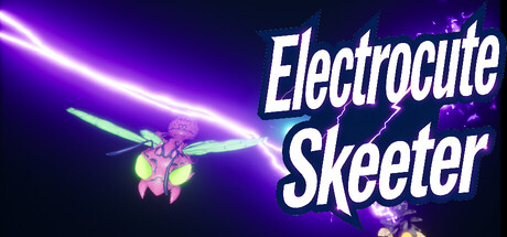
On a sweltering summer day, have you ever been annoyed by the buzzing near your ears? When you see skeeters swarming chaotically in the air by the roadside, don't you just want to wipe them all out at once? Here, skeeters will be continuously drawn in—zap them into crisps with your electric gun!
$0.991 user reviews
Top-Down ShooterIdlerAutomation
FU XINYUJan 9, 2026