Scoring genre clarity...

Kugayama Shiori's Death Diary capsule

Kugayama Shiori's Death Diary

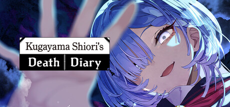
A mystery visual novel where horror meets occult comedy. Follow Kugayama Shiori, a ghost who casually dies over and over as she searches for her cause of death and the regrets that bind her to this world. Her investigation will eventually lead to a single incident—and the truth behind her demise.

$24.99Overwhelmingly Positive(384)
AdventureCasualVisual Novel
LaplacianApr 29, 2026

Kugayama Shiori's Death Diary scores 72/100 — better than 48% of Adventure capsules (n=7,922).

Overwhelmingly Positive (384 reviews) · $24.99 · Released Apr 29, 2026 · By Laplacian

Quick text summary

Kugayama Shiori's Death Diary scored 72/100 on Steam Analyzer — Good for a Adventure capsule. Top priority fix: [contrast_color] Increase value separation by brightening key character highlights (eyes, cheekbone) or darkening the background gradient to deepen silhouette definition at tiny size.

Capsule scores by dimension

  • Genre Clarity: 7/10 — Anime visual novel with mystery tone. The anime-styled character portrait and dreamy blue color palette clearly signal a narrative-driven visual novel. The title explicitly includes 'Death Diary' which hints at supernatural or occult themes. At tiny size, the soft-focus character and cool tones read as story-focused rather than action-oriented, though the specific horror-comedy tone is not fully apparent without reading the title.
  • Title Readability: 8/10 — Clear title with strong contrast bar. The title uses a stark black bar behind white text that creates excellent contrast against both the character and the Steam background. 'Kugayama Shiori's Death Diary' remains legible at small size due to the clean sans-serif font and deliberate spacing. At tiny size, the text compresses but the black-and-white treatment preserves readability better than would colored or outlined type over the busy character illustration.
  • Contrast & Color: 7/10 — Cool blues with soft highlights. The blue-dominant palette with purple and lavender tones creates distinct separation from the warm Steam background, though the value range is somewhat narrow and mid-tone heavy. The character's skin and hair use cool highlights that lift off the background, but the overall softness and blur effect reduce silhouette sharpness at tiny size. The white title bar is the strongest contrast anchor and ensures the capsule does not disappear into muddiness during quick scrolling.
  • Uniqueness & Polish: 7/10 — Stylized anime aesthetic, competent craft. The illustration demonstrates solid digital painting technique with soft lighting and cohesive color harmony typical of premium visual novel covers. The dreamy, slightly ethereal character treatment and muted palette differentiate it from high-saturation action game capsules. However, the soft-focus anime portrait approach is familiar within the visual novel genre, and the capsule reads as polished but not distinctly memorable or hook-driven compared to top-tier examples like Slay the Princess which feature iconic character poses or unique visual storytelling.
  • Brand Consistency: 6/10 — Cohesive art style, limited iconic elements. The cool blue palette and soft anime rendering style create internal consistency and appear aligned with a melancholic, mysterious narrative tone. The character Kugayama Shiori is rendered with recognizable visual design that could anchor future promotional materials. However, without examining the nine store screenshots, the capsule does not yet showcase a distinctive symbol, motif, or signature palette quirk that would make this game immediately identifiable on sight among peers in a visual novel catalogue.
  • Composition: 8/10 — Strong focal point, balanced layout. The character portrait is clearly centered and commands attention as the primary focal point, with secondary visual interest from the soft particle effects and hair movement. The title placement in the upper-left quadrant via the black bar avoids overlapping the character's face and uses negative space effectively. At small and tiny sizes, the composition holds well—the character remains the clear subject and the title remains readable without competing for focus, demonstrating resilient design across viewing scales.

What works

  • Strong title contrast. Black bar with white text ensures the title remains legible at all sizes and pops clearly against both the character and Steam background.
  • Clear focal point hierarchy. The character portrait dominates at center while the title bar guides the eye without visual conflict, maintaining readable composition at tiny size.
  • Cohesive art direction. The soft anime illustration style, cool color palette, and ethereal lighting create a unified, genre-appropriate aesthetic aligned with visual novel expectations.

What hurts the capsule

  • Narrow value contrast range. The blue-to-purple-to-lavender palette is internally harmonious but relies heavily on mid-tones, reducing silhouette punch and separation from background during a quick scroll.
  • Generic anime portrait formula. While well-executed, the soft-focus character portrait is a familiar visual novel cover trope that does not distinctly communicate the game's unique horror-comedy tone or core mechanic.
  • Soft-focus blur reduces icon clarity. The dreamy depth-of-field effect on the character adds aesthetic appeal but softens silhouette edges, which can make the image read as less defined at tiny thumbnail size compared to sharper, higher-contrast designs in the benchmark list.

Priority fixes

  1. [contrast_color] Increase value separation by brightening key character highlights (eyes, cheekbone) or darkening the background gradient to deepen silhouette definition at tiny size.
  2. [genre_clarity] Add a subtle visual motif or UI element (e.g., a diary icon, death-related symbol, or occult glyph) that hints at the horror-comedy and investigation core without relying on the title alone.
  3. [uniqueness_polish] Refine the character's pose or expression to convey agency, emotion, or a unique narrative hook that sets this apart from standard visual novel character portraits.

Store copy priority fixes

  1. [feature_communication] Expand the Urban Legend Encyclopedia description to explain its purpose: e.g., 'Collect archive entries to unlock the Urban Legend Encyclopedia—a compendium of lore that reveals hidden story threads and unlocks alternative paths.'
  2. [hook_strength] Strengthen the opening short description by leading with the death-loop mechanic verb: e.g., 'Die over and over as ghost Kugayama Shiori, uncovering the regrets binding her to this world in a mystery where horror meets dark comedy.'
  3. [feature_communication] Add specificity about choice consequences: e.g., 'Every choice ripples through the narrative, determining which ghosts appear, which memories surface, and which of the multiple endings you reach.'
  4. [uniqueness] Add a sentence emphasizing what makes the mystery unique: e.g., 'Unravel an urban legend mystery that shifts based on your decisions—no two playthroughs reveal the same truth.'

Related guides

Steam app ID: 4141950 · Tags: Adventure, Casual, Visual Novel, Choose Your Own Adventure, 2D Platformer