Scoring genre clarity...
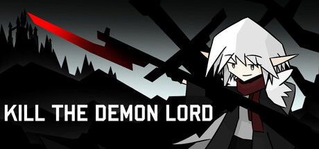
Instead of waiting at the end of your adventure, the Demon Lord decided to fight you right at the very beginning. Not very sporting of her... Pretty sure she broke a few rules. She can’t keep this up forever. Kill the anomaly.
Free to PlayPositive(37)
Bullet HellActionTop-Down Shooter
NowakiNov 21, 2025