Scoring genre clarity...
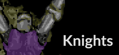
A free PvP multiplayer game featuring brave knights who must wander deep into dangerous dungeons and pursue various goals. Explore the randomly generated maps, fight zombies, vampire bats and other knights, and race to be first to complete your Quest.
Free to Play6 user reviews
Dungeon CrawlerHack and SlashExploration
Stephen Thompson, Kalle MarjolaMay 22, 2026