Constellar scores 75/100 — better than 68% of Shoot 'Em Up capsules (n=814).

Quick text summary

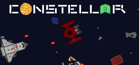
Constellar scored 75/100 on Steam Analyzer — Good for a Shoot 'Em Up capsule. Top priority fix: [uniqueness_polish] Add a subtle visual cue or effect that hints at the elemental combo mechanic—such as a glowing aura or collision effect around projectiles—to differentiate the core gameplay hook from standard retro shooters.

Capsule scores by dimension

  • Genre Clarity: 8/10 — Clear retro arcade shooter identity. The capsule immediately signals a space shooter through classic pixel-art spacecraft, scattered projectiles, and a dark starfield background with asteroid-like objects. At tiny size, the silhouette of the ship on the left and the red enemy sprite in the center remain readable and evoke Galaga or Space Invaders. The elemental twist is subtly hinted by the colorful projectiles (yellow, blue, red) suggesting ability variety, though the core genre—arcade action—reads strongly.
  • Title Readability: 7/10 — Strong at full, moderate at tiny. The title 'ICONSTELLAR' uses a bold, geometric sans-serif with white letterforms that contrast well against the dark navy background. At small size it remains legible; at tiny size the letters compress but remain distinguishable. The integrated gold planet glyph in place of an 'O' is a clever touch that adds visual interest, though at very small scales the planet detail may blur slightly.
  • Contrast & Color: 8/10 — Strong value separation and silhouettes. White title text pops cleanly against the dark navy starfield, and the bright pixel sprites—gold planet, red enemy, yellow/blue projectiles, and white spacecraft—all maintain clear silhouettes even at reduced sizes. In grayscale, the light-to-dark ratio remains strong. The scattered small stars and background asteroids provide atmospheric context without muddying the primary elements, and the overall composition avoids color mud.
  • Uniqueness & Polish: 7/10 — Polished retro aesthetic with modern craft. The capsule captures a nostalgic arcade feel with clean pixel-art execution and intentional visual hierarchy. The design avoids feeling like a generic asset pack—the integrated planet logo, deliberate sprite placement, and balanced color accents suggest thoughtful art direction. However, the concept itself (retro space shooter) is familiar territory, so while the craft is solid, the visual hook is incremental rather than groundbreaking compared to top-tier indie releases.
  • Brand Consistency: 7/10 — Cohesive retro brand with logo anchor. The integrated planet-in-title motif acts as a recognizable brand identifier, and the consistent pixel-art rendering style across the spacecraft, enemies, and projectiles creates a unified visual language. The color palette (white, gold, red, blue, navy) is restrained and memorable. Without access to the other store screenshots, this reads as internally consistent, though the identity leans on established retro-game visual codes rather than introducing a wholly distinctive signature.
  • Composition: 8/10 — Clear focal hierarchy with good depth. The title anchors the top, the spacecraft sits left-center as a secondary focal point, and the large red enemy sprite dominates the center-right, creating clear visual flow. The scattered projectiles and background stars provide atmospheric layering without competing for attention. At small and tiny sizes, the composition maintains readability with no critical elements lost to edge cropping, and the balance of negative space keeps the design breathing despite the busy starfield.

What works

  • Bold, readable title with integrated logo. The white geometric typeface with the gold planet glyph provides clear brand identity and remains legible down to small sizes.
  • Strong contrast against dark background. White text and bright pixel sprites pop cleanly against the navy starfield, ensuring quick visual recognition during fast scrolling.
  • Coherent retro aesthetic with intentional craft. Pixel-art execution is polished and consistent across all elements, avoiding a cheap or generic asset feel.
  • Clear focal hierarchy and balanced composition. The arrangement of title, ships, and enemies creates intuitive visual flow with no dead zones or scattered attention.

What hurts the capsule

  • Familiar genre trope with limited novelty. While well-executed, the retro arcade shooter theme is a well-trodden path that does not visually distinguish itself from other indie action titles at a glance.
  • Elemental combo mechanic not immediately obvious. The colored projectiles hint at ability variety, but the capsule does not clearly communicate the unique selling point of combined elemental effects and boss-vanishing mechanics.
  • Tiny size planet detail may blur. The integrated gold planet in the title, while charming at full size, risks losing definition in thumbnail view, which could reduce logo impact.

Priority fixes

  1. [uniqueness_polish] Add a subtle visual cue or effect that hints at the elemental combo mechanic—such as a glowing aura or collision effect around projectiles—to differentiate the core gameplay hook from standard retro shooters.
  2. [title_readability] Ensure the planet glyph in the title has a subtle outline or thicker stroke to maintain legibility and impact at thumbnail sizes below 120px width.
  3. [genre_clarity] Consider adding a faint energy or elemental visual effect on the enemy sprite to signal the modern twist and combo system, reinforcing that this is not a direct Space Invaders clone.

Store copy priority fixes

  1. [hook_strength] Strengthen the short description opening: replace 'A reinterpretation of retro games' with a verb-forward hook like 'Master elemental combos to destroy waves of enemy ships in this retro arcade shooter' to lead with gameplay impact.
  2. [feature_communication] Remove the celestial object list (Ursa, Serpens, Corvus, etc.) and consolidate the repeated 'explore' messaging into one concise sentence about planetary progression.
  3. [tone_match] Cut or relocate the Big Mac joke to match the retro arcade tone consistently throughout, or integrate it earlier if self-aware humor is part of the brand voice.
  4. [audience_targeting] Add one sentence clarifying difficulty accessibility, such as 'Adjustable difficulty scales for both arcade veterans and newcomers' to signal inclusive appeal.

Related guides

Steam app ID: 4148950 · Tags: Shoot 'Em Up, Top-Down Shooter, Action, Shooter, Retro