Scoring genre clarity...
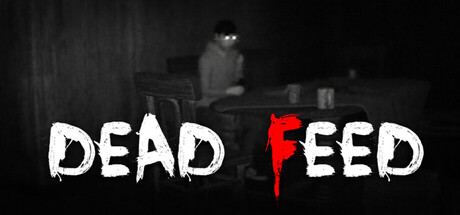
DEAD FEED is a psychological ghost-hunting horror game where you control two friends investigating a haunted house. One explores the darkness while the other monitors the feeds, as something unseen and paranormal slowly turns their investigation into a quiet, creeping nightmare.
$2.99Mostly Positive(48)
SimulationWalking Simulator3D
SolitaryStudiosNov 28, 2025