Scoring genre clarity...

Go To the Finish capsule

Go To the Finish

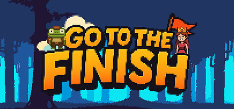
Embark on a dangerous yet fun journey as a brave little frog with one simple goal — reach the princess. This fast-paced 2D platformer puts precision, timing, and patience to the test. Each level is filled with traps, obstacles, and tricky situations that force you to learn from your mistakes.

$0.99No user reviews
ActionAdventure2D Fighter
PIxel Pear StudioJan 30, 2026

Go To the Finish scores 80/100 — better than 91% of Action capsules (n=8,535).

No user reviews · $0.99 · Released Jan 30, 2026 · By PIxel Pear Studio

Quick text summary

Go To the Finish scored 80/100 on Steam Analyzer — Good for a Action capsule. Top priority fix: [uniqueness_polish] Add a subtle visual hint of platforming challenge (e.g., scattered obstacles or trap silhouettes) to communicate the 'precision and timing' core mechanic beyond just character rescue.

Capsule scores by dimension

  • Genre Clarity: 8/10 — Clear platformer with whimsical charm. The pixel art frog character on the left and princess figure on the right immediately signal a 2D platformer with adventure elements. The stylized cityscape background with neon cyan accents reinforces a modern indie game aesthetic. At tiny size, the character silhouettes and pixel art style remain legible enough to communicate platformer genre, though fine details blur slightly.
  • Title Readability: 9/10 — Excellent bold typography hierarchy. The title 'GO TO THE FINISH' uses large, bold golden-orange letterforms with strong black outlines that contrast sharply against the dark blue background. The text is positioned centrally with ample breathing room and remains completely legible at small and tiny sizes due to thick stroke weight and high saturation. No tagline clutter interferes with the core message.
  • Contrast & Color: 9/10 — Strong value separation and vibrant pop. The golden-orange title contrasts excellently against the dark navy blue background, creating immediate visual separation. The cyan neon elements and bright character sprites punch through cleanly in grayscale due to strong light-dark value differences. Even at tiny size, the warm-cool color contrast and silhouettes remain distinct and never muddy.
  • Uniqueness & Polish: 7/10 — Solid indie craft with familiar tropes. The pixel art style and frog-rescues-princess premise feel competent and charming but follow established indie platformer conventions rather than breaking new ground. The neon cityscape backdrop adds visual interest and distinguishes it from typical fantasy platformers, though the overall execution remains solidly competent rather than innovative. Clean, intentional design without cheap asset vibe, landing in good indie range.
  • Brand Consistency: 7/10 — Coherent pixel art with clear character identity. The frog character and princess figure establish a recognizable core duo that would function as brand identity across marketing. The consistent pixel art rendering style, color palette of golden yellows and cyan accents, and retro game aesthetic feel unified throughout. Character designs are simple enough to be memorable, though without deeper brand signals beyond the visual theme.
  • Composition: 8/10 — Well-balanced hierarchy with clear focal points. The composition arranges the frog on the left and princess on the right with the title positioned centrally between them, creating natural visual flow. The neon cityscape background sits deep without competing for attention, and foreground characters anchor the design clearly. Safe margins protect all elements from Steam cropping, and the layout reads effectively even when reduced to tiny thumbnail size.

What works

  • Bold readable title with strong outlines. Golden-orange text with thick black borders ensures the title pops and remains legible across all viewing sizes without degradation.
  • Distinctive character silhouettes. The frog and princess figures are instantly recognizable and communicate the game's quirky adventure premise at a glance.
  • Excellent contrast against dark background. Warm golden and cool cyan colors create strong value separation that makes the capsule visible even during quick Steam scrolling.
  • Coherent pixel art style. Consistent retro aesthetic across all elements reinforces indie platformer identity without feeling generic or template-based.

What hurts the capsule

  • Princess figure lacks visual prominence. The right-side princess character is smaller and less defined than the frog, creating subtle attention imbalance that could be strengthened.
  • Neon cityscape feels somewhat generic. While visually appealing, the cyan-lit background is a common indie game trope that doesn't uniquely differentiate this platformer's visual identity.
  • Limited visual storytelling of core mechanic. The capsule communicates 'frog rescues princess' but doesn't hint at the precision platforming, trap-filled levels, or learning-from-mistakes gameplay loop described.

Priority fixes

  1. [uniqueness_polish] Add a subtle visual hint of platforming challenge (e.g., scattered obstacles or trap silhouettes) to communicate the 'precision and timing' core mechanic beyond just character rescue.
  2. [composition] Increase princess figure size and detail to create more balanced visual weight between the two main characters and avoid left-side dominance.
  3. [genre_clarity] Consider adding a small UI or environmental element (e.g., a checkpoint flag or obstacle spike) to reinforce platformer specificity and differentiate from generic adventure titles.

Store copy priority fixes

  1. [genre_clarity] Remove or clarify the 'Racing' and '2D Fighter' tags, or add a sentence explaining how those mechanics integrate into the platformer (e.g., if there is time-based racing or combat elements).
  2. [uniqueness] Add a sentence that articulates what makes this frog's journey distinct—specific mechanic, visual style, or narrative twist that differentiates it from standard platformers.
  3. [feature_communication] Expand the content details: specify the difficulty progression, control mechanics (is it tight-feeling precision platforming?), or any unlockables beyond levels.
  4. [audience_targeting] Add explicit language targeting the intended skill tier: 'Challenging even for platformer veterans' or 'Accessible entry point with mastery depth' to set clear expectations.

Related guides

Steam app ID: 4151060 · Tags: Action, Adventure, 2D Fighter, Arcade, Puzzle