Quick text summary
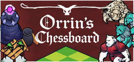
Orrin's Chessboard scored 72/100 on Steam Analyzer — Good for a Tower Defense capsule. Top priority fix: [uniqueness_polish] Introduce a signature character or memorable icon (e.g., highlight Orrin or a core chess-themed creature) as a recognizable brand anchor that distinguishes the game.
Capsule scores by dimension
- Genre Clarity: 7/10 — Strategy tower defense cues present. The chessboard diamond pattern in the center immediately signals strategy gameplay, and the scattered character/creature assets on the sides suggest tactical positioning. At TINY size, the board graphic and fantasy character silhouettes remain readable enough to imply strategy, though the tower defense and roguelite mechanics are not explicitly visual.
- Title Readability: 8/10 — Clear serif title, excellent contrast. Orrin's Chessboard uses a clean, thick serif font in white centered on the dark brown background, providing strong legibility at all sizes. The title remains readable even at TINY size due to generous letter spacing and high value contrast; the decorative horizontal line above adds polish without sacrificing clarity.
- Contrast & Color: 8/10 — Strong value separation, vibrant accents. The dark burgundy-brown background provides excellent contrast for white title text and bright character sprites (magenta, teal, yellow, red). The lime-green chessboard at center creates a focal point that pops against the warm background, and character silhouettes maintain clear separation even at TINY size due to saturated colors and strong outlines.
- Uniqueness & Polish: 7/10 — Whimsical fantasy charm, solid craft. The asymmetrical character placement and hand-drawn sprite aesthetic create a distinctive, approachable indie feel that stands apart from generic strategy templates. The illustrated creatures and warm color palette convey personality, though the overall composition feels slightly scattered rather than showcasing a core mechanic or unique hook.
- Brand Consistency: 6/10 — Cohesive art style, limited iconic identity. The hand-drawn sprite style and fantasy character palette are internally consistent throughout the capsule, creating a unified visual direction. However, without access to in-game assets, the capsule does not establish a strong, immediately recognizable brand signature beyond 'whimsical fantasy strategy'—no iconic symbol, color motif, or character stands out as distinctly Orrin's Chessboard.
- Composition: 7/10 — Balanced layout, clear focal point. The centered chessboard serves as a strong primary focal point, while character assets frame the title on left and right, creating a stable three-part composition. At SMALL and TINY sizes the arrangement holds together well; title placement is safe from crop, and the layered depth (background, board, creatures, text) guides the eye naturally—though edge-hugging characters risk minor clipping on some Steam viewports.
What works
- High-contrast white title on dark field. Orrin's Chessboard remains legible at all viewing sizes due to thick serif letterforms and strong value separation.
- Vibrant sprite characters and green board. Saturated color palette with teal, magenta, yellow, and lime pops effectively against the dark background and maintains silhouette clarity at TINY size.
- Balanced three-part composition. Left and right character frames with centered chessboard create stable hierarchy that does not compete for attention.
What hurts the capsule
- Scattered character placement lacks cohesion. Multiple creatures and assets around the border feel randomly placed rather than intentionally composed, reducing visual storytelling impact.
- Core mechanic (terrain manipulation, roguelite) not visually implied. The capsule shows chess and fantasy elements but does not communicate the unique selling point of card-based path-reshaping gameplay.
- Limited brand identity signals. No iconic character, logo motif, or distinctive color signature that uniquely identifies Orrin's Chessboard—feels generic within indie fantasy strategy space.
Priority fixes
- [uniqueness_polish] Introduce a signature character or memorable icon (e.g., highlight Orrin or a core chess-themed creature) as a recognizable brand anchor that distinguishes the game.
- [genre_clarity] Add a subtle visual hint of the card mechanic or terrain-reshaping gameplay, such as cards overlaying the board or a terrain tile highlight, to communicate the unique roguelite hook.
- [composition] Refine character placement to create intentional framing around the title rather than scattered edge assets—arrange creatures to guide the eye inward toward the board.
Store copy priority fixes
- [hook_strength] Rewrite 'change your fate' to specify a tactical consequence: e.g., 'Alter the terrain to force enemies into kill zones and reshape their path every turn.'
- [uniqueness] Add a sentence to the short description that clarifies why terrain-altering tower defense is distinct: e.g., 'Every placement you make reshapes the entire battlefield—no two runs play the same.'
- [tone_match] Replace 'opening up a wide range of strategic possibilities' with more conversational, game-specific language that reflects the actual depth (e.g., 'Each upgrade choice stacks into wildly different playstyles').
- [audience_targeting] Add a sentence acknowledging casual players: e.g., 'Adjust difficulty to learn at your own pace, or crank it up for endless strategic depth.'
Related guides
Steam app ID: 4152760 · Tags: Tower Defense, Strategy, Turn-Based Strategy, Indie, Turn-Based Tactics