Scoring genre clarity...

Asterogue capsule

Asterogue

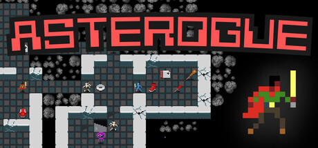
A sci-fi roguelike where you descend 17 procedurally generated levels into a hollow asteroid. Battle aliens, collect futuristic weapons and nanotech, manage hunger and permadeath. Fast, minimal, turn-based combat inspired by the original Rogue.

$5.997 user reviews
Traditional RoguelikeRoguelikeDungeon Crawler
Chris McCormickMar 31, 2026

Asterogue scores 78/100 — better than 86% of Traditional Roguelike capsules (n=148).

7 user reviews · $5.99 · Released Mar 31, 2026 · By Chris McCormick

Quick text summary

Asterogue scored 78/100 on Steam Analyzer — Good for a Traditional Roguelike capsule. Top priority fix: [uniqueness_polish] Add a signature character sprite or UI element (like a highlighted protagonist or unique nanotech visual) in the mid-right area to create a memorable visual hook that differentiates from generic roguelike screenshots.

Capsule scores by dimension

  • Genre Clarity: 8/10 — Retro roguelike dungeon crawler clearly communicated. The pixelated dungeon map layout, roguelike enemy sprites, and procedural room generation immediately signal a tactical turn-based roguelike. The sci-fi context is reinforced by the futuristic weapon sprite (red and green pixel art) on the right. At tiny size, the dungeon grid and sprite elements remain recognizable as roguelike/strategy gameplay.
  • Title Readability: 9/10 — Bold red title reads perfectly at all sizes. ASTEROGUE in large, clean red sans-serif font contrasts sharply against the dark background and maintains full legibility at tiny thumbnail size. The title is positioned in the upper area with clear separation from the dungeon map below, avoiding overlap with gameplay visuals. Letter forms remain distinct even at 120x45 resolution.
  • Contrast & Color: 8/10 — Strong red title and bright sprite separation. The bright red ASTEROGUE title pops distinctly against the dark teal dungeon grid and black background, creating excellent value separation. The small bright red, green, and yellow sprites on the right add color accent and readability. In grayscale test, silhouettes remain clear with strong light-dark differentiation.
  • Uniqueness & Polish: 7/10 — Authentic retro roguelike visual identity. The pixel art dungeon layout and sprite aesthetic feel authentic to the roguelike genre with clean, intentional pixelation that signals indie craft rather than lazy asset use. The composition shows specific gameplay elements (procedural rooms, enemy and weapon sprites) rather than generic sci-fi theme. The style is distinctive within the roguelike space but not groundbreaking compared to genre leaders like Hades II or Balatro.
  • Brand Consistency: 7/10 — Coherent retro pixel art throughout. The uniform pixel art style, limited color palette (reds, greens, blues, yellows), and teal dungeon aesthetic create internal cohesion. The brand identity clearly communicates 'retro roguelike' through consistent rendering and visual language. Without seeing other screenshots, the style suggests recognizable indie identity, though no unique character or signature motif is prominent in this capsule alone.
  • Composition: 8/10 — Clear hierarchy with title and gameplay separation. The red title anchors the top with the dungeon map and sprite details below creating natural visual hierarchy and focal flow. The layout uses the full width effectively with the weapon sprite accent on the right providing balance. At small size, the composition remains readable with the title dominating and map detail supporting; no critical elements sit dangerously close to crop edges.

What works

  • Excellent title contrast and readability. Bold red ASTEROGUE stands out sharply against dark background and remains perfectly legible at tiny thumbnail sizes.
  • Gameplay clarity through visual elements. Dungeon grid, enemy sprites, and weapon icon immediately communicate the roguelike turn-based strategy genre without ambiguity.
  • Authentic retro aesthetic. Consistent pixel art style and limited palette feel intentional and cohesive rather than generic or cheap.

What hurts the capsule

  • Limited visual uniqueness in composition. While the pixel art is solid, the capsule uses a straightforward 'title + gameplay screenshot' layout without a distinctive hook or premium visual flourish that separates it from other retro roguelikes.
  • Dungeon detail reads as secondary at tiny size. At 120x45 resolution, the procedural map becomes noise; the capsule relies entirely on title recognition rather than selling a unique visual moment or character.

Priority fixes

  1. [uniqueness_polish] Add a signature character sprite or UI element (like a highlighted protagonist or unique nanotech visual) in the mid-right area to create a memorable visual hook that differentiates from generic roguelike screenshots.
  2. [composition] Consider overlaying a subtle sci-fi frame or HUD element (health bar, inventory icon) on the dungeon to add polish and gameplay narrative without increasing clutter.

Store copy priority fixes

  1. [uniqueness] Expand 'WHAT MAKES ASTEROGUE DIFFERENT' to include one concrete mechanical example (e.g., how the hunger system or nanotech system differs from other roguelikes) rather than relying solely on philosophical traditionalism.
  2. [feature_communication] Add a 1-2 sentence explanation of the hunger system's strategic role in the detailed description (e.g., 'manage hunger between battles to avoid starvation—ignore it and you'll die faster than any alien').
  3. [tone_match] Integrate the story context more tightly into gameplay description; rewrite the STORY section to explain how narrative context motivates the descent or affects decision-making, not just world-building.

Related guides

Steam app ID: 4152940 · Tags: Traditional Roguelike, Roguelike, Dungeon Crawler, Sci-fi, Space