Scoring genre clarity...

Not My Child capsule

Not My Child

A psychological horror where a father returns home, only to find toys and haunting notes that whisper a truth he refuses to face.

$5.993 user reviews
ActionAction-AdventureInvestigation
SciPera GR Apr 18, 2026

Not My Child scores 68/100 — better than 17% of Action capsules (n=8,535).

3 user reviews · $5.99 · Released Apr 18, 2026 · By SciPera GR

Quick text summary

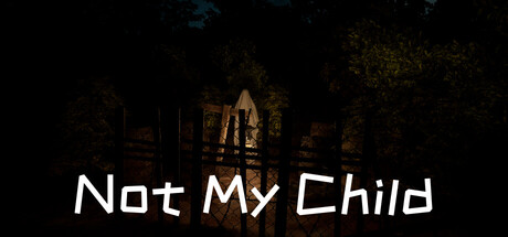
Not My Child scored 68/100 on Steam Analyzer — Solid for a Action capsule. Top priority fix: [uniqueness_polish] Introduce a recognizable visual motif—such as a silhouette of a child's toy, scattered objects on floor, or a symbolic architectural element unique to the game's narrative—to create memorability and distinguish from generic haunted-house tropes.

Capsule scores by dimension

  • Genre Clarity: 7/10 — Horror mood clear, mechanics unclear. The dark, moody house interior with warm golden lighting immediately signals psychological horror and dread. The abandoned, dimly lit domestic space communicates unease and supernatural threat. However, at tiny size the architectural details collapse into murk, making it harder to distinguish this from general dark fantasy or adventure horror rather than a specific gameplay mechanic.
  • Title Readability: 8/10 — Bold sans-serif, strong placement. The title 'Not My Child' uses a clean, geometric sans-serif typeface in white with excellent contrast against the dark background, positioned in the lower third on a relatively clear zone. The letterforms remain legible even at small and tiny sizes due to consistent stroke weight and minimal decoration. At tiny size there is slight blur but the title remains recognizable as readable English text.
  • Contrast & Color: 8/10 — Warm gold separates from dark void. The warm golden-orange interior lighting creates strong value separation from the deep black surroundings and Steam background, with the lit house standing out as the focal point. White title text pops cleanly against the dark foundation. At tiny size the silhouette of the lit structure still reads distinctly due to the warm-to-dark transition, and grayscale conversion maintains clear separation.
  • Uniqueness & Polish: 6/10 — Competent horror setting, generic execution. The capsule presents a conventional haunted-house aesthetic with moody lighting and architectural framing, which is executed cleanly but lacks a distinctive visual hook or memorable identity element. The image reads as a professional stock-style scene rather than conveying the game's unique mechanic—a father's psychological denial—through visual storytelling or symbolic imagery. The craft is solid but the approach is familiar within horror genre conventions.
  • Brand Consistency: 5/10 — Minimal identity, generic horror tropes. The capsule presents no clear iconic character, logo mark, or signature visual motif that would establish recognizable brand identity for 'Not My Child' specifically. The warm-lit house aesthetic is a standard horror visual language shared across many titles and offers no internal cue that signals this particular game's narrative about parental denial or its psychological focus. Without reference to other game materials, this capsule could belong to many horror titles.
  • Composition: 7/10 — Clear focal point, safe margins respected. The lit house interior dominates the center-right area as the primary focal point, with the dark void creating visual breathing room and balance. The title is positioned securely in the lower portion away from dangerous edges, and the composition avoids clutter or competing elements. At small size the hierarchy reads immediately; the warm structure draws attention before the title registers, creating natural flow and no cropping risk.

What works

  • Title legibility at scale. White sans-serif 'Not My Child' text maintains readability from full header down to tiny thumbnail due to clean letterforms and strong contrast.
  • Strong warm-dark contrast. The golden-lit house silhouette separates decisively from the black background, creating silhouette clarity that survives the grayscale squint test.
  • Uncluttered composition. Single focal point with breathing room and no edge-hugging elements minimize visual noise and ensure safe margins for Steam cropping.

What hurts the capsule

  • No distinctive brand identity. The generic haunted-house aesthetic offers no unique icon, symbol, or signature visual that could be recognized as belonging specifically to this game's narrative about parental denial.
  • Gameplay mechanic not communicated. The capsule shows atmospheric dread but fails to hint at the core narrative hook—a father's refusal to accept truth—through symbolic or compositional storytelling.
  • Architectural detail lost at tiny size. Fine building details and subtle lighting nuances that define the focal point collapse into undifferentiated warm murk below small viewport, reducing specificity.

Priority fixes

  1. [uniqueness_polish] Introduce a recognizable visual motif—such as a silhouette of a child's toy, scattered objects on floor, or a symbolic architectural element unique to the game's narrative—to create memorability and distinguish from generic haunted-house tropes.
  2. [brand_consistency] Add a subtle logo, tagline, or color palette signature element that appears consistently across store materials to build internal brand cohesion.
  3. [genre_clarity] Consider adding a foreground element hinting at the domestic-horror mechanic—such as toys, family photos, or handwritten notes—to signal psychological horror specifically rather than supernatural dread.

Store copy priority fixes

  1. [feature_communication] Add a sentence clarifying the core gameplay loop: 'Search the home for objects, examine cryptic clues, and piece together fragmented memories through environmental storytelling and interactive sequences.' This bridges the investigation tag and action tags.
  2. [uniqueness] Insert a sentence that articulates the game's specific emotional or narrative hook: 'Confront a father's denial and guilt through unreliable memories that shift as you discover the truth' or similar—differentiating from generic amnesia horror.
  3. [feature_communication] Specify playtime, whether there are puzzles or dialogue choices, and clarify what 'unsettling environment' entails (visual distortion, sound design, supernatural events, etc.).
  4. [audience_targeting] Reconcile the gore/action tags with the tone: either downplay those tags if the game is quiet narrative horror, or explain what violent or action-oriented moments occur to set correct expectations.

Related guides

Steam app ID: 4157670 · Tags: Action, Action-Adventure, Investigation, Singleplayer, Horror