Scoring genre clarity...

Stories Adrift: Wake - Prologue capsule

Stories Adrift: Wake - Prologue

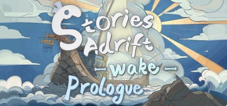
As the new owner of a book boat, you are entrusted with returning a single page of a book and embarks on a journey through a world both mysterious and familiar. By solving intricate puzzles and piecing together scattered clues, you uncover the truth of the world - and of yourself.

Free to Play9 user reviews
AdventureIndiePuzzle
HIATUS ProductionsDec 20, 2025

Stories Adrift: Wake - Prologue scores 68/100 — better than 22% of Adventure capsules (n=7,922).

9 user reviews · Free to Play · Released Dec 20, 2025 · By HIATUS Productions

Quick text summary

Stories Adrift: Wake - Prologue scored 68/100 on Steam Analyzer — Solid for a Adventure capsule. Top priority fix: [title_readability] Condense title to single or two-line layout (e.g., 'Stories Adrift' main / 'Wake Prologue' sub) with increased font size for tiny-size legibility

Capsule scores by dimension

  • Genre Clarity: 7/10 — Adventure narrative with puzzle mystery. The stylized book-boat illustration and floating pages clearly signal a story-driven adventure game with fantastical elements. At tiny size, the central boat silhouette and cloud environment remain readable as an adventure setting, though the specific puzzle-adventure genre is slightly ambiguous without text. The art style and composition suggest narrative focus over action.
  • Title Readability: 6/10 — Readable at full size, struggles tiny. The white serif title 'Stories Adrift: Wake - Prologue' has decent contrast against the blue-gold background at full header size with an outlined treatment. However, at tiny size (120x45), the multi-line layout and serif letterforms compress significantly, and the subtitle 'Wake - Prologue' becomes difficult to parse clearly. The outline helps but the small point size and multiple text lines create legibility strain at scroll speed.
  • Contrast & Color: 7/10 — Good value separation, warm-cool balance. The capsule uses strong value contrast between light cream-white title text and the blue sky background, with warm golden tones in the clouds providing saturation depth. The boat structure in earth tones sits firmly in midground with clear silhouette against the bright sky. At tiny size, the overall light-dark separation remains clear in grayscale, though fine detail in the boat blurs slightly.
  • Uniqueness & Polish: 7/10 — Cohesive illustrated style, well-executed. The hand-drawn watercolor-like aesthetic with soft cloud forms and detailed boat architecture creates a distinctive indie adventure identity that stands apart from generic fantasy templates. The illustrative approach communicates craft and intentionality. However, the scene reads as a beautiful environment rather than a specific unique selling point or core mechanic hook—it's more atmosphere than gameplay promise.
  • Brand Consistency: 7/10 — Consistent watercolor storybook aesthetic. The warm-cool color palette, illustrative watercolor technique, and whimsical boat-centered composition establish a recognizable brand voice aligned with literary adventure games. The style should be internally consistent across store screenshots based on the unified art direction. The palette and soft rendering create a memorable identity, though there are no iconic character or motif anchors yet visible.
  • Composition: 7/10 — Clear focal point, well-layered depth. The central boat structure anchors a clear focal point with sky background, clouds in midground, and water elements creating depth layering. The title placement at top-center uses a controlled area above the main illustration. At small size, the composition reads cleanly with the boat as primary subject. The design respects safe margins, though some cloud detail at edges risks minor cropping on certain Steam displays.

What works

  • Distinctive illustrated aesthetic. The watercolor storybook art style with soft clouds and detailed boat architecture creates strong visual identity that signals indie narrative adventure.
  • Strong value contrast. White text and light boat silhouette separate clearly from blue sky background, maintaining readability at small sizes in grayscale.
  • Clear focal hierarchy. The centered boat structure serves as unambiguous primary subject with supporting cloud and sky elements that frame rather than compete.
  • Coherent color palette. Warm-cool balance between golden clouds and blue sky creates visual harmony and premium feel appropriate to the game's narrative tone.

What hurts the capsule

  • Multi-line title compression. At tiny size, 'Stories Adrift: Wake - Prologue' breaks across multiple lines creating text density that loses clarity during quick scroll.
  • Generic scene without mechanic clarity. While beautiful, the composition shows environment and atmosphere rather than communicating the specific puzzle-solving or page-collection gameplay loop.
  • Serif font small-size weakness. The chosen serif typeface, though elegant at full size, produces thin letterforms that compress and lose distinctiveness below 100px width.

Priority fixes

  1. [title_readability] Condense title to single or two-line layout (e.g., 'Stories Adrift' main / 'Wake Prologue' sub) with increased font size for tiny-size legibility
  2. [genre_clarity] Add subtle visual icon or motif (floating page, book symbol) to reinforce the puzzle-book-collection mechanic beyond pure landscape
  3. [composition] Ensure no critical boat detail sits within 15px of left/right edges to protect against Steam aspect-ratio cropping across display types

Store copy priority fixes

  1. [hook_strength] Rewrite the opening to lead with the emotional or narrative hook: 'A single missing page holds the key to a world's mystery—and your own. As the owner of a book boat, you must recover it.' This is more immediate and evocative than plot summary.
  2. [feature_communication] Expand feature descriptions with concrete examples: instead of 'Narrative-driven puzzles where you investigate,' write 'Narrative-driven puzzles: examine environments, collect clues, and unlock memories to piece together what happened.' Add a sentence explaining the scope (prologue length, estimated playtime).
  3. [tone_match] Move or significantly reduce the developer apology message to a separate FAQ or 'About This Version' section so the atmospheric opening copy remains the first impression and primary tone-setter.
  4. [uniqueness] Add one sentence that articulates what makes this game's puzzle or narrative design distinct, e.g., 'Unlike linear adventures, every clue you uncover reshapes your understanding of the world itself,' or reference a specific mechanic inspired by its literary influences.

Related guides

Steam app ID: 4159900 · Tags: Adventure, Indie, Puzzle, Hand-drawn, Point & Click