Scoring genre clarity...

Chromatic Battles capsule

Chromatic Battles

Match colors to survive enemy waves. Control and upgrade your rotating ship in this shooter-survival blend. Journey through space to save Kaleida!

$4.99
Early AccessLooter ShooterShoot 'Em Up
NightWave GamesMar 2, 2026

Chromatic Battles scores 72/100 — better than 42% of Early Access capsules (n=3,067).

$4.99 · Released Mar 2, 2026 · By NightWave Games

Quick text summary

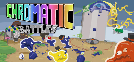
Chromatic Battles scored 72/100 on Steam Analyzer — Good for a Early Access capsule. Top priority fix: [genre_clarity] Emphasize the color-matching mechanic visually—consider replacing or highlighting one enemy type with a distinct color match indicator or aura to signal the unique survival mechanic.

Capsule scores by dimension

  • Genre Clarity: 7/10 — Action shooter with color mechanic. The capsule clearly communicates an action game through the dynamic scene of a rotating ship firing projectiles at enemies on a sandy battlefield. The colorful palette and projectile effects hint at a color-matching mechanic, though at tiny size the specific color-matching survival element becomes less obvious. The central ship silhouette and enemy formations read as shooter-action at all sizes.
  • Title Readability: 8/10 — Bold neon title, solid legibility. The 'CHROMATIC' text uses bright neon gradient (lime to magenta to cyan) with thick, bold letterforms that maintain readability even at tiny sizes. The 'BATTLES' subtitle in white sits cleanly below with good separation. At tiny size the title still reads as readable neon text, though the gradient effect softens slightly and exact letter detail becomes less crisp.
  • Contrast & Color: 8/10 — Vibrant neon palette, strong pop. The bright neon green, cyan, magenta, and yellow title colors create excellent separation against the blue-gray background sky. The orange-red creature on the right foreground and blue ship silhouettes provide clear value and hue contrast. In grayscale the title still reads as light against medium background, and the colored projectiles and character silhouettes maintain edge clarity even at tiny zoom.
  • Uniqueness & Polish: 7/10 — Playful indie aesthetic, cohesive style. The art direction feels intentional with a cartoony, vibrant 2D style that stands apart from generic sci-fi shooters through its whimsical character design and colorful battle chaos. The composition and character poses (running, falling shapes) convey action and personality beyond a static scene. However, the scene borders on busy and the overall visual hook (color-matching mechanic) is not immediately obvious from the capsule alone, keeping it in solid rather than excellent territory.
  • Brand Consistency: 6/10 — Consistent cartoon style, weak identity. The capsule shows a cohesive cartoony art style with consistent rendering of characters and environmental elements across the scene. However, without reference to other store assets, there are no strong iconic symbols, signature motifs, or memorable brand markers that would make this instantly recognizable as Chromatic Battles specifically. The 'CHROMATIC' title and neon gradient become the primary brand signal.
  • Composition: 7/10 — Clear focal ship, balanced layout. The rotating blue ship in the center-right creates a strong focal point that reads clearly at all sizes, with enemy shapes and projectiles creating dynamic movement around it. The composition uses good depth layering with foreground creatures, midground action, and background building. At tiny size the central ship remains the clear primary subject, though the busy particle field and scattered enemy elements compete slightly for attention without causing major illegibility.

What works

  • Strong neon title contrast. The bright gradient 'CHROMATIC' text pops clearly against the blue-gray background at all viewing sizes and maintains readability even when squinted or at tiny scale.
  • Clear focal point and hierarchy. The central rotating ship immediately draws the eye and remains the primary subject at small and tiny sizes, guiding player understanding of the game's core mechanic.
  • Cohesive cartoony visual style. The art direction is consistent with playful character designs and vibrant coloring that feels intentional and premium compared to generic asset-based designs.
  • Effective depth and layering. Background building, midground action, and foreground creatures create dimensional composition that prevents flatness and maintains visual interest.

What hurts the capsule

  • Color mechanic not immediately obvious. While the game is about matching colors to survive, the capsule does not clearly communicate this core mechanic—it reads more as a generic shooter battle scene.
  • Busy mid-ground clutter. The scattered enemies, particles, and projectiles create visual noise that slightly dilutes focus and makes the scene feel crowded rather than polished at full size.
  • Weak brand identity signals. The capsule lacks iconic symbols or memorable motifs that would make it instantly recognizable as Chromatic Battles versus other indie action games.
  • Limited tagline visibility. The 'BATTLES' subtitle is readable but relatively small; at tiny sizes the full title-tagline pairing could benefit from slightly larger secondary text.

Priority fixes

  1. [genre_clarity] Emphasize the color-matching mechanic visually—consider replacing or highlighting one enemy type with a distinct color match indicator or aura to signal the unique survival mechanic.
  2. [uniqueness_polish] Reduce mid-ground particle clutter and reposition secondary enemies to create clearer visual hierarchy and a more premium, intentional composition.
  3. [brand_consistency] Introduce an iconic visual motif or symbol (e.g., a signature colored crystal, the ship's unique design feature, or Kaleida character) that becomes recognizable across marketing assets.

Store copy priority fixes

  1. [audience_targeting] Add 1-2 sentences clarifying difficulty or skill levels (e.g., 'Casual players can unlock assist modes; experts can master combos for speedrun potential') to signal who should buy now.
  2. [uniqueness] Replace 'no two playthroughs are the same' with a concrete example of how color combinations interact (e.g., 'Chain same-color combos to unlock temporary color amplifiers that cascade across enemy waves').
  3. [hook_strength] Expand the short description's second sentence to emphasize the combo/color-switching mechanic: 'Control and upgrade your rotating ship, switching colors to exploit enemy vulnerabilities and chain devastating combos.'

Related guides

Steam app ID: 4160010 · Tags: Early Access, Looter Shooter, Shoot 'Em Up, Tower Defense, Shooter