Scoring genre clarity...

Reflections of Life: Gone But Not Forgotten Collector's Edition capsule

Reflections of Life: Gone But Not Forgotten Collector's Edition

Can you save the city of Harmoris from the undead?

$19.992 user reviews
CasualPoint & ClickPuzzle
GrandMa StudiosNov 14, 2025

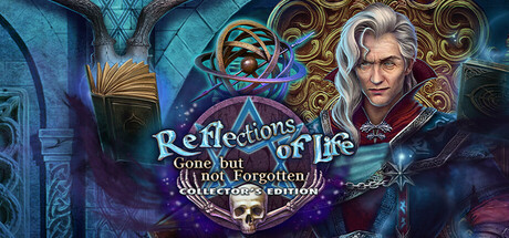
Reflections of Life: Gone But Not Forgotten Collector's Edition scores 67/100 — better than 15% of Casual capsules (n=10,153).

2 user reviews · $19.99 · Released Nov 14, 2025 · By GrandMa Studios

Quick text summary

Reflections of Life: Gone But Not Forgotten Collector's Edition scored 67/100 on Steam Analyzer — Solid for a Casual capsule. Top priority fix: [title_readability] Remove or simplify the subtitle and collector's edition text, keeping only the main 'Reflections of Life' title readable at 120x45 pixels.

Capsule scores by dimension

  • Genre Clarity: 7/10 — Gothic adventure clear at full size. The ornate golden frame, mystical blue lighting, spectral atmosphere, and elegant character portrait clearly signal a supernatural adventure game. At TINY size the ornamental border and character silhouette remain readable, though the gothic aesthetic becomes less distinct—the game reads as fantasy/adventure rather than a specific mechanic, which is appropriate for the hidden object adventure subgenre.
  • Title Readability: 6/10 — Title readable full, struggles tiny. The main title 'Reflections of Life' uses a decorative serif font with good contrast against the dark background at full size. At TINY size (120x45) the subtitle 'Gone but (all not forgotten)' and 'Collector's Edition' text become illegible—only the primary title holds, and fine serifs lose clarity at scaled reduction.
  • Contrast & Color: 7/10 — Strong value separation, vibrant palette. The capsule features high contrast between the dark teal/blue background, warm golden ornamental frame, and the pale-haired character portrait. The glowing magical elements and purple-pink accents stand out well against the dark foundation, reading cleanly even at small size. However, the busy texture in the background and central character slightly reduce the silhouette sharpness in grayscale.
  • Uniqueness & Polish: 7/10 — Premium gothic aesthetic, competent execution. The ornate golden frame, cinematic lighting, and character-focused composition feel polished and intentional rather than templated. The art direction signals a premium hidden object adventure with clear production values. Against top competitors like DREDGE and Chants of Sennaar, the execution is solid but relies on familiar gothic tropes without a distinctive visual hook that makes it immediately memorable.
  • Brand Consistency: 6/10 — Coherent gothic style, generic identity. The color palette (teal, gold, purple, pale skin tones) and ornamental frame style are internally consistent and cohesive throughout the composition. However, without knowing the franchise context, this visual identity could apply to many hidden object adventures—there is no immediately distinctive motif, character pose, or signature element that would make this capsule uniquely recognizable as Reflections of Life versus competitors.
  • Composition: 7/10 — Clear focal point, balanced layering. The elegant character portrait is the dominant focal point centered-right, with the ornate golden frame and title creating a clear hierarchy. The layering of background architecture, frame, and character portrait creates visual depth. At SMALL size the composition remains readable with the character and title as anchors, though at TINY size the supporting architectural elements become visual noise.

What works

  • Strong contrast against dark Steam background. The warm golden frame and cool blue-purple lighting create clear value separation that pops against #1b2838 at all viewing sizes.
  • Polished ornamental presentation. The decorative golden frame and cinematic character portrait convey premium production values and appeal to the hidden object adventure audience.
  • Character as focal point. The pale-haired character portrait naturally draws attention and communicates the adventure-fantasy tone immediately at full size.

What hurts the capsule

  • Subtitle and tagline illegible at tiny size. The secondary text 'Gone but (all not forgotten)' and 'Collector's Edition' become unreadable at 120x45 pixels, losing valuable marketing information.
  • Generic gothic identity without distinctive hook. The visual style, while competent, relies on familiar ornamental and supernatural tropes without a unique character, motif, or art direction that stands out in the genre.
  • Background texture creates visual competing. The busy architectural elements in the background compete for attention at small sizes, diluting focus from the primary character portrait and title.

Priority fixes

  1. [title_readability] Remove or simplify the subtitle and collector's edition text, keeping only the main 'Reflections of Life' title readable at 120x45 pixels.
  2. [uniqueness_polish] Add a distinctive visual signature—either a unique character expression, a signature supernatural effect, or a color accent that is instantly recognizable across marketing materials.
  3. [composition] Reduce background architectural detail or darken it further to create stronger midground separation and make the character portrait more visually isolated at small sizes.
  4. [contrast_color] Increase the character portrait outline or add a subtle rim light to improve silhouette clarity when the image is scaled down to thumbnail size.

Store copy priority fixes

  1. [hook_strength] Rewrite the short description to lead with the core gameplay verb and emotional hook: 'Search hidden corners of a cursed city, solve ancient puzzles, and uncover the truth behind an undead plague—with your owl companion at your side.' This immediately signals hidden-object gameplay and establishes what makes this adventure distinct.
  2. [uniqueness] Add a sentence contrasting this entry to the broader series or competing games: 'The first game in the series to pair hidden-object hunting with dynamic day-night siege mechanics' or 'Unlike linear adventure games, you control the pace of investigation across an open cursed city.' This differentiates from generic HOG templates.
  3. [audience_targeting] Include a brief audience signal after the story intro: 'Perfect for casual players seeking story-rich adventures without time pressure, plus completionists hunting all hidden owls and achievements.' This immediately clarifies who should buy.
  4. [tone_match] Remove or soften corporate marketing language ('Grandma Studios proudly presents the latest spine-tingling adventure') and replace with voice from the protagonist or world: 'You stand before the gates of Harmoris as darkness falls. Only you and your owl can uncover the truth...' This immerses rather than sells.

Related guides

Steam app ID: 4161050 · Tags: Casual, Point & Click, Puzzle, Hidden Object, 2D