Scoring genre clarity...
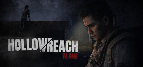
A third-person psychological horror focused on exploration and puzzle-solving. Trapped between the dead and his own thoughts, fight to maintain your sanity in a forgotten world. Each day echoes voices from the past — and the line between reality and delusion begins to fade.
$6.99Mostly Positive(33)
Post-apocalypticStory RichZombies
TDOG STUDIOSMar 12, 2026