Don't Crack! scores 73/100 — better than 58% of Action capsules (n=8,534).

Quick text summary

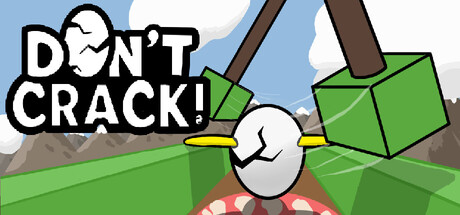
Don't Crack! scored 73/100 on Steam Analyzer — Good for a Action capsule. Top priority fix: [uniqueness_polish] Add visual chaos or motion cues (particle effects, impact lines, or a second character) to convey the 'chaotic' rage gameplay element and differentiate from passive platformers

Capsule scores by dimension

  • Genre Clarity: 7/10 — Clear platformer, fragile mechanic readable. The egg protagonist with 'Don't Crack!' text immediately signals a fragile platformer with comedic tone. The green blocks and obstacles communicate environmental hazards and action gameplay. At TINY size, the egg silhouette and warning text remain legible, though the exact rage/co-op element is not explicitly conveyed—it reads more as a casual platformer than a chaotic action game.
  • Title Readability: 8/10 — Bold white text, clear at all sizes. The title 'DON'T CRACK!' uses thick black outline on white, ensuring strong contrast against the light blue sky background and legibility at SMALL and TINY sizes. The exclamation mark reinforces urgency and tone. At full size the kerning is clean and the message is impossible to miss, though at TINY size some fine outline detail softens slightly.
  • Contrast & Color: 8/10 — Bright palette pops on dark Steam background. Lime green blocks, white egg, and blue sky create excellent value separation that reads strongly against Steam's #1b2838 dark background. The white text with black outline has exceptional silhouette clarity even in grayscale. The warm muddy hill tones provide depth without competing with the primary subjects.
  • Uniqueness & Polish: 6/10 — Charming but familiar indie platformer style. The art style is clean and cartoon-friendly with intentional character design (anthropomorphic egg), but the overall execution feels competent rather than distinctive. The green geometric blocks and simple hill environment are pleasant but do not immediately differentiate from other indie platformers in the market. Visual storytelling communicates the core fragility mechanic clearly, but the premium factor is moderate.
  • Brand Consistency: 7/10 — Consistent style, memorable egg character. The white egg with simple features becomes an iconic character that could anchor brand recognition across store assets. The color palette (lime green, white, sky blue, tan earth) is cohesive and repeatable. The cartoonish geometric art direction is consistent, though without reference to the 5 store screenshots, broader identity signals cannot be fully validated.
  • Composition: 8/10 — Strong focal point, balanced hierarchy. The egg sits as the clear center focal point with the title 'DON'T CRACK!' anchoring the upper left, guiding attention naturally. The green blocks and falling platform create depth layers (foreground action, midground character, background sky), and the composition remains clear at SMALL size with no edge-crushing of critical elements. The layout respects safe margins and avoids clutter despite multiple visual elements.

What works

  • Iconic egg protagonist. The white egg character with simple features is memorable and immediately communicates the core fragility mechanic that defines the game.
  • Excellent title contrast and readability. Bold black outline on white ensures the 'DON'T CRACK!' text is legible at all viewing sizes including TINY thumbnails.
  • Strong color separation from Steam background. Lime green, white, and sky blue palette creates high contrast against the dark #1b2838 background for quick discoverability.
  • Clear composition hierarchy. The egg is the unambiguous focal point with supporting elements (blocks, platforms, title) arranged in a balanced layout that guides the eye logically.

What hurts the capsule

  • Generic platformer visual language. The green geometric blocks and simple environment lean heavily on familiar indie platformer tropes without a distinctive visual hook that separates it from similar titles.
  • Rage/chaos mechanic not visually evident. The capsule communicates 'fragile platformer' but does not convey the chaotic or co-op rage elements described in the game's core appeal, potentially underselling the experience.
  • Moderate premium feel. While clean and competent, the execution does not feel premium or highly polished compared to top-tier action-adventure benchmarks; it reads as solid indie rather than standout.

Priority fixes

  1. [uniqueness_polish] Add visual chaos or motion cues (particle effects, impact lines, or a second character) to convey the 'chaotic' rage gameplay element and differentiate from passive platformers
  2. [genre_clarity] Introduce action-specific iconography (velocity lines, hazard indicators, or co-op player silhouettes) to signal the game's intensity and multiplayer or solo rage-focused loop
  3. [brand_consistency] Cross-reference the 5 store screenshots to identify and amplify any signature visual motifs (recurring props, UI elements, or artistic flourishes) that can anchor brand identity across all assets

Store copy priority fixes

  1. [uniqueness] Add a specific comparison or differentiator (e.g., "Unlike standard co-op platformers, one player doesn't see what the other controls, forcing real-time communication") to reinforce why the split-control mechanic is unique.
  2. [audience_targeting] Expand family-friendly messaging by adding a line about accessibility features or how the cartoon art and humor appeal to younger players, given the Family Sharing category.
  3. [feature_communication] Replace the generic "Built With Community Input" statement with 1–2 concrete examples of how community feedback shaped specific levels, mechanics, or difficulty balance.

Related guides

Steam app ID: 4163290 · Tags: Action, Adventure, Arcade, Platformer, 3D Platformer