Scoring genre clarity...
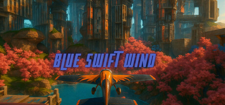
A vibrant arcade plane racer! Battle with power-ups across 12 stylized tracks, from serene to chaotic scenic routes. Use power-ups and master drifting in dynamic weather to become the swiftest pilot in this stylized, anime-inspired world, With more free tracks arriving in future updates.
$0.741 user reviews
RacingArena Shooter3D Platformer
pixscribNov 27, 2025