Scoring genre clarity...
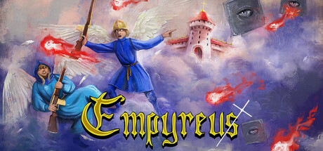
A short, free danmaku bullet hell following two gun-wielding angels as war unfolds in Heaven. Dodge dense Touhou-style patterns, face demanding boss fights, and uncover skill-based secrets in this tight retro experience. Survive the bullet hell and restore the bullet heaven!
Free to Play7 user reviews
ActionBullet HellShoot 'Em Up
Ludi AntiquiJan 6, 2026