Scoring genre clarity...

Light Fall capsule

Light Fall

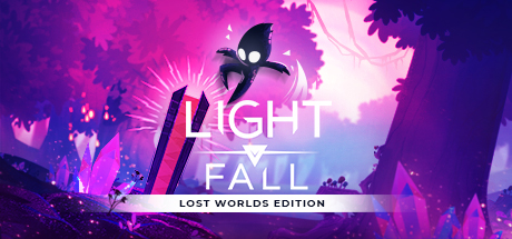
Craft your path in this innovative 2D platformer. Master the use of your own platform to explore the Forgotten World of Numbra and save the land and its inhabitants from an imminent threat. Do you have what it takes to survive in perilous Numbra?

$14.99Very Positive(104)
IndieActionAdventure
Bishop GamesApr 26, 2018

Light Fall scores 75/100 — better than 69% of Indie capsules (n=11,449).

Very Positive (104 reviews) · $14.99 · Released Apr 26, 2018 · By Bishop Games

Quick text summary

Light Fall scored 75/100 on Steam Analyzer — Good for a Indie capsule. Top priority fix: [title_readability] Increase subtitle font size or add subtle outline to LOST WORLDS EDITION to maintain clarity at thumbnail sizes below 120px width.

Capsule scores by dimension

  • Genre Clarity: 7/10 — Clear action platformer with mystical tone. The floating character silhouette with glowing eyes and dynamic pose against a vibrant purple landscape clearly signals an action game. The platformer nature is readable from the character's stance and the vertical composition, though the mystical/fantasy art style could suggest puzzle or adventure equally well. At tiny size, the silhouette and glow effects remain distinct enough to recognize movement-based gameplay.
  • Title Readability: 8/10 — Strong sans-serif hierarchy with clean separation. LIGHT FALL is rendered in bold, clean white sans-serif that contrasts sharply against the purple gradient background and reads clearly at all sizes. The subtitle LOST WORLDS EDITION sits on a dark horizontal bar that isolates it well from the chaotic background. At tiny size, both the main title and subtitle remain legible, though the subtitle becomes compressed; the primary title maintains excellent clarity.
  • Contrast & Color: 8/10 — Vibrant magenta palette with strong value separation. The hot magenta and purple background creates dramatic lighting that separates the black silhouette character and red/dark accent shapes with clear value contrast. The white title text has maximum contrast against the warm-toned background, and the glow effects around the character add luminous depth. In grayscale, the character maintains strong silhouette separation, though some midtone purple foliage blends slightly; the composition holds well at tiny size.
  • Uniqueness & Polish: 7/10 — Polished visual identity with distinctive aesthetic. The art direction shows intentional craft—the character design with glowing eyes is memorable, the landscape silhouettes create visual storytelling, and the neon-glow lighting treatment feels cohesive and premium. However, the mystical-landscape-with-glowing-protagonist approach is not entirely unique within indie platformers; the execution is solid but the core concept follows established visual tropes. The polish is evident in consistent rendering and effect quality, placing it in the good-but-not-groundbreaking range.
  • Brand Consistency: 7/10 — Coherent color palette and character motif. The capsule establishes internal consistency through unified purple/magenta color grading, the distinctive glowing-eyed character silhouette that appears to be a recurring protagonist, and a cohesive art direction suggesting a specific world. The character's shape and glow treatment would be recognizable across marketing materials. However, without reference to other brand touchpoints, brand strength is assessed only on internal cohesion, which is solid but not iconic enough for a 9.
  • Composition: 8/10 — Clear focal hierarchy with balanced spatial layering. The glowing character positioned in the left-center area serves as the primary focal point, with supporting landscape silhouettes (trees, cliff faces) creating depth layers behind it. The title is anchored top-center with logical separation from the character, avoiding overlap and maintaining safe margins. At tiny size, the composition reads clearly with the character and title as distinct focal areas; the landscape elements support without competing, and no critical content sits dangerously close to edges.

What works

  • Excellent title contrast and readability. White sans-serif text with sharp outline pops decisively against the warm purple gradient at all viewing sizes, remaining legible even at tiny thumbnail scale.
  • Strong atmospheric visual identity. The glowing character silhouette against vibrant magenta landscape creates an immediately recognizable and memorable aesthetic specific to this game.
  • Clean spatial hierarchy and depth. Clear foreground-midground-background layering with the protagonist as focal point guides the eye logically without clutter at small and tiny sizes.

What hurts the capsule

  • Genre clarity slightly ambiguous at thumbnail size. While the character pose suggests action, the mystical aesthetic could equally imply puzzle or narrative adventure, reducing immediate genre recognition at quick glance.
  • Subtitle becomes compressed at tiny sizes. LOST WORLDS EDITION on the dark bar is readable at small size but approaches legibility limits at true thumbnail scale due to font size and horizontal compression.
  • Some purple foliage blends midtones. In grayscale evaluation, the tree/foliage silhouettes in the background lack full tonal separation from the gradient, slightly reducing contrast clarity in desaturated conditions.

Priority fixes

  1. [title_readability] Increase subtitle font size or add subtle outline to LOST WORLDS EDITION to maintain clarity at thumbnail sizes below 120px width.
  2. [contrast_color] Add a thin dark outline or shadow to purple foliage elements to boost silhouette separation in grayscale and improve tiny-size readability.
  3. [genre_clarity] Consider adding a subtle UI element or platform shape hint to reinforce the platformer mechanic and reduce action-adventure ambiguity at glance.

Store copy priority fixes

  1. [hook_strength] Replace 'Do you have what it takes to survive in perilous Numbra?' with a more specific, action-driven hook such as 'Conjure platforms mid-air to carve your own path through a world of darkness and deception' to make the core appeal immediately visceral.
  2. [uniqueness] Add a direct statement of differentiation such as 'Unlike traditional platformers, you aren't constrained to preset paths—every level can be solved using your Shadow Core however you imagine' to justify the 'innovative' claim with concrete reasoning.
  3. [feature_communication] In the 'Vast World to Explore' section, add specific challenge types or enemy descriptions (e.g., 'face shadow creatures and environmental hazards') to clarify what obstacles the Shadow Core helps you overcome.
  4. [audience_targeting] Add a sentence about difficulty level or accessibility, such as 'Accessible to newcomers but challenging for speedrunners,' to help players self-identify whether this game matches their skill and patience level.

Related guides

Steam app ID: 416830 · Tags: Indie, Action, Adventure, Platformer, 2D