Scoring genre clarity...

Operation: Outbreak capsule

Operation: Outbreak

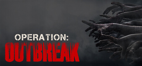
Your squad's vehicle exploded during a patrol, and you're the only survivor. The enemy is unusual this time. A virus has turned the city into a warzone of the undead. Get to the exfil in time or die trying. A free-to-play short and intense FPS zombie survival horror game.

Free to PlayMostly Positive(491)
ZombiesHorrorSurvival Horror
DREADMITH GamesDec 20, 2025

Operation: Outbreak scores 70/100 — better than 37% of Zombies capsules (n=672).

Mostly Positive (491 reviews) · Free to Play · Released Dec 20, 2025 · By DREADMITH Games

Quick text summary

Operation: Outbreak scored 70/100 on Steam Analyzer — Good for a Zombies capsule. Top priority fix: [uniqueness_polish] Introduce a signature visual element—distinctive gear, a unique zombie variant, or environmental detail—that communicates the core 'military squad survivor' premise and differentiates from generic zombie games.

Capsule scores by dimension

  • Genre Clarity: 7/10 — Zombie horror shooter evident. The grimy diseased hands reaching from the right side clearly signal undead/zombie content, and the military aesthetic with the title framing suggests action-shooter combat. At tiny size, the silhouettes of the grotesque hands remain recognizable enough to communicate horror-action, though specific zombie identity softens due to image compression and dark tones blending slightly into the background.
  • Title Readability: 8/10 — Strong contrast, readable across sizes. The white 'OPERATION:' text and bold red 'OUTBREAK' text create excellent value separation against the dark grey background. The title placement in the left-center area avoids busy elements and remains legible at small and tiny sizes; the red text in particular pops immediately and sustains clarity even at thumbnail scale.
  • Contrast & Color: 8/10 — High value separation, clean silhouettes. White title text and red accent word contrast sharply against the dark grey-toned background, creating strong visual hierarchy. The diseased hand silhouettes on the right maintain clear separation through tonal layering and edge definition, reading distinctly even when squinted or viewed at small sizes.
  • Uniqueness & Polish: 6/10 — Competent zombie horror setup. The imagery communicates the core concept—zombie outbreak, survival horror—in a straightforward way with decent craft in lighting and hand rendering. However, the composition and visual treatment feel conventional for the zombie genre; it lacks a distinctive visual hook, memorable art direction, or unique mechanical storytelling that would elevate it beyond the baseline expectation for survival horror shooters.
  • Brand Consistency: 6/10 — Functional but generic identity. The capsule uses standard military-horror iconography and a dark, gritty color palette common to zombie survival games, but contains no distinctive visual motif, character, or signature element that would be instantly recognizable as 'Operation: Outbreak' specifically. The presentation is internally coherent in tone but lacks memorable brand identity markers.
  • Composition: 7/10 — Clear focal hierarchy, minor balance issues. The title anchors the left side with strong visual weight, while the zombie hands on the right create a secondary focal point that guides the eye inward. The balance works at full size, but at tiny size the composition risks feeling slightly left-heavy; the hands remain visible but secondary, which is appropriate for genre context though the center-right area could benefit from stronger midground layering.

What works

  • Title legibility at all sizes. White and red text maintains crisp readability from full header to tiny thumbnail due to high contrast against dark background and strategic left-center placement.
  • Genre communication via silhouettes. The diseased zombie hands immediately signal undead-horror content and establish visual stakes without requiring readable UI or text parsing.
  • Strong value contrast and separation. Foreground elements (hands, title) stand out clearly from the dark grey background even in grayscale test, supporting quick visual scanning.

What hurts the capsule

  • Generic visual presentation. The zombie horror imagery and color scheme follow well-worn conventions without a distinctive visual hook or unique selling point that differentiates it from competitor titles.
  • Lack of brand identity cues. No iconic character, symbol, logo motif, or signature palette element that would make this capsule immediately recognizable as 'Operation: Outbreak' rather than any generic zombie survival game.
  • Minimal midground depth. The composition relies heavily on title and hand elements with limited layering in the center, creating potential imbalance and a flatter visual read at small sizes.

Priority fixes

  1. [uniqueness_polish] Introduce a signature visual element—distinctive gear, a unique zombie variant, or environmental detail—that communicates the core 'military squad survivor' premise and differentiates from generic zombie games.
  2. [brand_consistency] Add a recognizable logo, emblem, or repeating visual motif (e.g., military insignia, outbreak marker) that anchors brand identity and would be memorable across store screenshots.
  3. [composition] Strengthen midground layering with additional environmental context (ruins, wreckage, or tactical elements) to create visual depth and balance the left-heavy title placement.

Store copy priority fixes

  1. [uniqueness] Add 1–2 sentences explaining what makes this game's approach distinct: e.g., 'Unlike traditional zombie shooters, Outbreak forces you to choose between speed and stealth—every alarm alert spawns reinforcements,' or highlight unique map design or mechanic that competitors lack.
  2. [feature_communication] Restructure the detailed description to include a bulleted 'Core Mechanics' section covering: weapon progression, enemy types, environmental hazards, and special abilities or tools available during the 10–20 minute run.
  3. [hook_strength] Rewrite the final sentence of the short description to lead with a unique tension or choice rather than generic survival language: e.g., 'Navigate a virus-ravaged city where every gunshot risks attracting deadly hordes—do you run silent or fight through?' instead of 'or die trying.'
  4. [tone_match] Soften or remove the casual 'Have fun!' closing and the student project disclaimer from the main copy; relocate it to a small, separate text block to preserve horror atmosphere while maintaining transparency.

Related guides

Steam app ID: 4169300 · Tags: Zombies, Horror, Survival Horror, Shooter, FPS