Scoring genre clarity...

QuadKings: Fog of Checkmate capsule

QuadKings: Fog of Checkmate

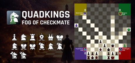
4 Player Chess meets strategy in QuadKings: Fog of Checkmate. Clash on one battlefield, form fragile alliances, and outsmart three opponents at once. Navigate the chaos of a four-way checkmate. One throne. Four kings. Do you have the vision to survive the crossfire?

$3.99
StrategyTabletopIndie
RoboForgeStudiosMar 4, 2026

QuadKings: Fog of Checkmate scores 77/100 — better than 79% of Strategy capsules (n=5,103).

$3.99 · Released Mar 4, 2026 · By RoboForgeStudios

Quick text summary

QuadKings: Fog of Checkmate scored 77/100 on Steam Analyzer — Good for a Strategy capsule. Top priority fix: [composition] Enlarge or emphasize the central board layout and add visual cues (like color-coded player zones or asymmetric piece positioning) to communicate 4-player gameplay more clearly at small sizes.

Capsule scores by dimension

  • Genre Clarity: 8/10 — Chess strategy core immediately obvious. The chessboard dominates the right side with clear piece placement, while the left sidebar displays chess pieces in icon form, making the strategy game nature unmistakable. At tiny size, the board grid and white/black piece symbols remain legible enough to signal chess gameplay, though the 4-player multiplayer aspect is less obvious from visuals alone.
  • Title Readability: 8/10 — Strong logo and title contrast. The white 'QUADKINGS' text with 'FOG OF CHECKMATE' subtitle sits on a dark background with a knight chess piece logo on the left, providing excellent contrast against the dark brown gradient. The title remains readable at small and tiny sizes due to bold sans-serif letterforms and clear spacing, though the subtitle becomes slightly cramped at thumbnail size.
  • Contrast & Color: 8/10 — Dark atmosphere with bright focal points. The capsule uses a warm brown-orange gradient background that contrasts well with white text and piece icons, while the chessboard's light squares provide bright silhouettes against darker areas. The grayscale test shows strong value separation between foreground elements and background, helping key visuals read clearly even at tiny sizes.
  • Uniqueness & Polish: 7/10 — Thematic presentation with competent craft. The layout combines chess iconography with a 4-player board setup, using the piece display sidebar and active game board to communicate core mechanics distinctly. The execution is polished and intentional, though the design follows familiar chess game visual conventions without a highly distinctive artistic signature that would elevate it to premium tier.
  • Brand Consistency: 7/10 — Recognizable chess identity with clear theming. The knight logo, piece library sidebar, and chessboard layout form a cohesive internal visual language that clearly identifies this as a chess game, and the dark atmospheric color palette with white accents is consistent throughout. The 'fog of checkmate' concept is reinforced by the shadowed silhouette figure on the left, creating a memorable identity hook specific to the 4-player multiplayer angle.
  • Composition: 8/10 — Balanced layout with clear hierarchy. The left side anchors the logo and piece references while the right showcases the active game board as the primary focal point, creating good depth layering. The composition maintains strong readability at small sizes with the board naturally drawing focus, though the board's complexity might overwhelm at tiny sizes when detail becomes unresolvable.

What works

  • Chess identity immediately clear. The combination of prominent chessboard, piece iconography, and knight logo makes the genre unmistakable at all viewing sizes.
  • Strong dark contrast strategy. White text and light piece symbols against warm brown background create excellent value separation that holds up well even at thumbnail size.
  • Cohesive visual language. Logo, piece library, and board layout work together as a unified system that communicates both chess gameplay and the unique 4-player multiplayer aspect.

What hurts the capsule

  • 4-player mechanic not visually obvious. While the board is shown, the unique four-way competitive element is not clearly communicated in the visual composition; it reads as standard chess rather than emphasizing the multiplayer chaos angle.
  • Board complexity reduces clarity at tiny. The chessboard's individual squares and piece placement become difficult to parse at thumbnail sizes, reducing the visual impact of the primary focal point.
  • Generic strategic game aesthetic. While competently executed, the overall presentation uses familiar chess game visual conventions without a distinctive artistic hook that would stand out among indie strategy titles.

Priority fixes

  1. [composition] Enlarge or emphasize the central board layout and add visual cues (like color-coded player zones or asymmetric piece positioning) to communicate 4-player gameplay more clearly at small sizes.
  2. [uniqueness_polish] Introduce a distinctive art style element (custom piece designs, signature particle effect, or unique color scheme) that sets the visual identity apart from standard chess game presentations.
  3. [contrast_color] Increase the saturation or luminosity contrast of the chessboard squares or add subtle color-coded player indicators to help the multiplayer aspect read faster at thumbnail sizes.

Store copy priority fixes

  1. [hook_strength] Replace 'Chess meets strategy' in the short description with a verb-forward hook that contrasts to 1v1 chess, such as: 'Command a four-way battlefield where one wrong move can turn allies into enemies. Master chess against three opponents at once.'
  2. [uniqueness] Add a dedicated sentence explaining what 'Fog of Checkmate' means mechanically and how it changes the chess experience, e.g., 'Limited vision of opponent moves, unpredictable alliance shifts, or larger board tactics.'
  3. [feature_communication] Clarify the exact board size, match duration, and turn structure (real-time or turn-based) early in the detailed description to help players understand the pacing and commitment required.
  4. [audience_targeting] Rebalance the later sections to emphasize social and casual play equally with competitive features, and reinforce the alliance and diplomacy system as a primary draw, not just a secondary mechanic.

Related guides

  • Steam page optimisationCapsule, copy, screenshots, tags — the full Steam page conversion stack.
  • Steam tags guideTag selection, ordering, and how it shapes Steam's recommendation rails.

Steam app ID: 4171730 · Tags: Strategy, Tabletop, Indie, Real Time Tactics, 2D