FruitFall Catcher scores 78/100 — better than 82% of Casual capsules (n=10,153).

Quick text summary

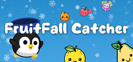
FruitFall Catcher scored 78/100 on Steam Analyzer — Good for a Casual capsule. Top priority fix: [uniqueness_polish] Incorporate a subtle visual cue representing the bomb hazard or progressive speed mechanic (such as a subtle bomb shape or motion lines) to differentiate the core loop.

Capsule scores by dimension

  • Genre Clarity: 8/10 — Clear casual arcade gameplay. The cute anthropomorphic fruit characters, falling snowflakes, and cheerful penguin mascot immediately signal a lighthearted casual game. The fruit-catching premise is visually obvious from the array of smiling fruit sprites positioned as if mid-fall. At tiny size, the distinct character silhouettes and bright primary colors still read as a fun, accessible arcade-style game.
  • Title Readability: 9/10 — Excellent legibility across all sizes. The white sans-serif title 'FruitFall Catcher' is positioned prominently in the upper-center region with strong contrast against the blue background and no competing texture underneath. The letterforms remain crisp and fully readable even at tiny thumbnail size due to bold weight and strategic spacing. The title placement avoids crowding and maintains clear separation from game elements.
  • Contrast & Color: 8/10 — Strong value separation, cohesive palette. The bright blue background provides excellent contrast against white title text, colorful fruit characters, and the black-and-white penguin. Each character element has distinct saturation and value that stands out against the #1b2838 Steam background. At small and tiny sizes, the silhouettes remain clear and separation is maintained without muddy mid-tones, though the snowflake pattern introduces minor visual noise.
  • Uniqueness & Polish: 7/10 — Polished cute aesthetic, moderate originality. The capsule demonstrates solid craft with consistent kawaii-style character design, clean vector illustration, and a cohesive cheerful mood that matches the casual genre expectation. The execution feels intentional and well-rendered, but the concept of cute falling fruit with a mascot character is relatively common in mobile and casual indie games. The visual presentation is above-average polish without a distinctive mechanical hook or standout visual narrative.
  • Brand Consistency: 7/10 — Recognizable character-led identity. The penguin mascot and consistent kawaii fruit art style establish a memorable visual identity that would be recognizable across marketing materials and store screenshots. The warm pastel color palette and smiling character expressions create internal cohesion throughout the design. However, without seeing the full store context, the identity reads more as a standard cute indie brand rather than something with a unique signature motif.
  • Composition: 8/10 — Clear hierarchy, balanced focal points. The layout features a natural visual hierarchy with the title anchoring the top, the penguin providing a strong left-side mascot anchor, and fruit characters distributed across the middle-right to suggest falling/catching action. The composition creates depth and guides the eye without clustering or dead space, and important elements avoid unsafe margins. At tiny size, the arrangement maintains clarity with the penguin and title as the primary read.

What works

  • Outstanding title contrast and legibility. White sans-serif text is positioned on solid blue background with no competing texture, remaining fully readable at all sizes including tiny thumbnails.
  • Cohesive cute aesthetic and polish. Vector illustration style is clean and consistent, with intentional character design and color choices that reinforce the casual, accessible game experience.
  • Clear genre signals and gameplay implication. The falling fruit sprites, penguin mascot, and snowflake environment immediately communicate a fun arcade-style catching game without ambiguity.
  • Effective spatial composition. Layout balances title positioning, mascot placement, and distributed fruit elements to create visual interest and guide the eye naturally across the composition.

What hurts the capsule

  • Generic cute indie aesthetic. While well-executed, the overall visual concept relies on familiar kawaii design tropes common across many casual games, limiting distinctive brand differentiation.
  • Snowflake pattern adds visual noise. The scattered snowflake background texture creates minor clutter that competes slightly with core character silhouettes at smaller viewing sizes.
  • No unique mechanical hook visualized. The capsule communicates 'cute fruit catcher' but does not visually highlight what makes this game mechanically distinct from similar titles, such as the progressive difficulty or bomb hazard.

Priority fixes

  1. [uniqueness_polish] Incorporate a subtle visual cue representing the bomb hazard or progressive speed mechanic (such as a subtle bomb shape or motion lines) to differentiate the core loop.
  2. [contrast_color] Reduce snowflake density or adjust opacity to minimize background noise and ensure fruit silhouettes remain the dominant read at small sizes.
  3. [brand_consistency] Develop a signature visual motif (unique penguin expression variant, recurring fruit character names, or distinct UI accent color) to strengthen recognition across all store materials.

Store copy priority fixes

  1. [hook_strength] Replace the opening 'Test your reflexes' with an action-forward hook that leads with the penguin character or the thrill of multipliers: 'Catch falling fruits and chain multiplier bonuses in this adorable arcade dash, where every level brings new chaos and bigger rewards.'
  2. [uniqueness] Expand the Level Editor section with 2-3 concrete examples of custom challenges or community creations to show what creative players can build and how this differentiates FruitFall from other catch games.
  3. [audience_targeting] Add a sentence after the opening describing dual play styles: mention that players can enjoy a relaxing casual pace or chase leaderboards and high multipliers, bridging the 'Relaxing' tag with the arcade action.
  4. [feature_communication] Add a line clarifying the relationship between casual and intense play—e.g., 'Play at your own pace with the Level Editor, or race against ever-increasing difficulty in Endless Mode' to make the breadth of appeal explicit.

Related guides

Steam app ID: 4172370 · Tags: Casual, Action, Arcade, 2D, Colorful