Scoring genre clarity...
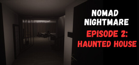
The sequel to the psychological horror Nomad Nightmare. The protagonist tries to return to a normal life, but the past finds him again. Explore a mysterious house where fear and madness lurk around every corner.
$2.996 user reviews
AdventurePuzzleWalking Simulator
Nutria Gold, krmkhnvDec 5, 2025