Domestic Cat scores 60/100 — better than 0% of Space capsules (n=1,282).

Quick text summary

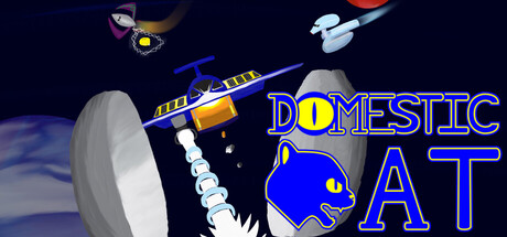
Domestic Cat scored 60/100 on Steam Analyzer — Solid for a Space capsule. Top priority fix: [title_readability] Redesign the title with a larger, bolder font and increase letter spacing to maintain legibility at 120x45 pixel size, or use a minimal icon-based logo instead.

Capsule scores by dimension

  • Genre Clarity: 7/10 — Space mining shooter clearly signaled. The capsule immediately communicates a space-themed mining game through the prominent spaceship (Domestic Cat), asteroid field, and space environment with planets. At tiny size, the yellow and blue spaceship silhouette and rocky asteroids remain readable enough to suggest the mining gameplay loop, though the exact casual indie tone is less obvious without context.
  • Title Readability: 6/10 — Title readable at full, struggles tiny. The title 'DOMESTIC CAT' uses a bold blue outline font positioned prominently in the center-right, which reads clearly at full size with good contrast against the dark space background. At tiny size (120x45), the letterforms collapse significantly and become difficult to parse due to small point size and thin letter spacing, reducing immediate recognition.
  • Contrast & Color: 7/10 — Strong value separation with warm accent. The bright yellow and blue spaceship pops well against the dark blue-black space background, creating solid silhouette separation that holds at small sizes. The orange/yellow gradient on the ship and blue planet provide warm-cool contrast that catches attention, though some mid-tone gray rocks blend slightly into the darker space regions in grayscale.
  • Uniqueness & Polish: 5/10 — Generic space mining scene, lacks hook. The composition feels like a standard space-mining template with asteroids, planets, and a spaceship positioned predictably across the canvas. There is no distinctive visual hook, unique art style flourish, or clear mechanical callout that differentiates this from dozens of other space-themed indie games; the cute cat reference in the title is not reinforced visually.
  • Brand Consistency: 5/10 — Minimal identity signals present. The capsule does not clearly reinforce a recognizable brand identity beyond the generic space-mining aesthetic; the 'Domestic Cat' name is not visually represented through character design, iconography, or distinctive palette that would allow later recognition. Without access to broader brand context, the capsule reads as interchangeable with similar space indie titles.
  • Composition: 6/10 — Centered elements with mild hierarchy. The spaceship occupies the center-left with title text center-right, creating a balanced but slightly static layout with two competing focal points at small size. The scattered asteroids and planets provide depth layering, but they feel decorative rather than compositionally purposeful, and the arrangement does not guide the eye toward a single clear primary subject at tiny size.

What works

  • Spaceship silhouette clarity. The yellow-blue Domestic Cat spaceship reads as a distinct ship shape with recognizable form even at reduced sizes.
  • Dark space background control. The dark navy-black background provides a clean, non-distracting canvas that lets bright elements breathe without clutter.

What hurts the capsule

  • Title becomes illegible at tiny size. The 'DOMESTIC CAT' text collapses into an unreadable blur at 120x45 due to small point size and thin letter spacing.
  • Generic theme with no unique visual hook. The scene is a standard space-mining template with no distinctive art direction, signature style, or mechanical clarity that sets it apart from competitor capsules.
  • Cat branding not visually reinforced. Despite the title prominently featuring 'Domestic Cat,' no feline character, icon, or thematic visual element appears in the capsule to support the brand identity.

Priority fixes

  1. [title_readability] Redesign the title with a larger, bolder font and increase letter spacing to maintain legibility at 120x45 pixel size, or use a minimal icon-based logo instead.
  2. [uniqueness_polish] Add a visible cat character or distinctive cat-themed icon (e.g., cat-shaped cockpit, feline emblem on ship) to visually anchor the 'Domestic Cat' brand and differentiate from generic space-mining templates.
  3. [composition] Strengthen focal point hierarchy by enlarging the spaceship as the primary focal point and repositioning secondary elements (asteroids, planets) to guide the eye rather than compete for attention at small sizes.

Store copy priority fixes

  1. [hook_strength] Rewrite the short description to open with an active verb and emotional hook: 'Mine asteroids, dodge patrols, and haul ore across the Solar System in this retro arcade miner—inspired by 1980s home console classics.' This immediately signals action and tone.
  2. [feature_communication] Expand the game modes section with specific examples: 'Hardcore Mode removes starting upgrades for a true challenge; Asteroid Blitz accelerates asteroid movement for faster-paced runs.' This clarifies replayability and gives players concrete reasons to explore modes.
  3. [uniqueness] Add a sentence that articulates what makes Domestic Cat distinct: 'Unlike typical space miners, the Domestic Cat's retro 8-bit aesthetic and procedural sector generation create a unique throwback experience.' Clearly state the differentiator.
  4. [tone_match] Vary sentence structure and replace repetitive 'you will' constructions: 'Pilot the Domestic Cat through 100 sectors. Manage fuel carefully. Mine asteroids. Evade patrols.' This creates rhythm that matches the casual, arcade-style mood.

Related guides

Steam app ID: 4175010 · Tags: Space, Minimalist, Mining, Spaceships, 1980s