Scoring genre clarity...
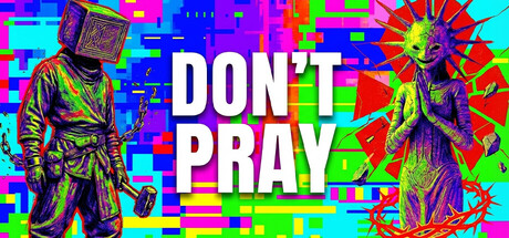
Don't Pray is the world’s first Magic PvP shooter with built-in aimbot and wallhack. Yes. Seriously. Gods won't save you here, but they might listen. Pray to ancient statues for game-breaking powers or map-altering chaos. Assemble your team, combine skills, and out-think the arena.
Free to Play5 user reviews
Co-opAdventurePvP
Summer Game StudioFeb 9, 2026