Scoring genre clarity...

Hivefront TD capsule

Hivefront TD

Collect your insect army and defend the hive as either Ants or Bees in this awesome tower defense adventure, brought to life with a hand-drawn art style!

Free to PlayPositive(10)
StrategyTower Defense2D
SUPER ANT STUDIODec 29, 2025

Hivefront TD scores 73/100 — better than 57% of Strategy capsules (n=5,103).

Positive (10 reviews) · Free to Play · Released Dec 29, 2025 · By SUPER ANT STUDIO

Quick text summary

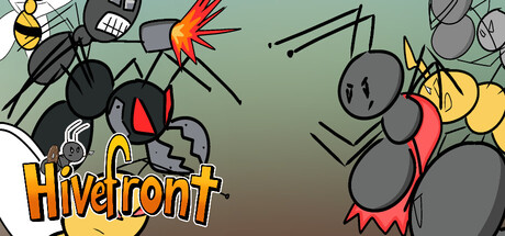
Hivefront TD scored 73/100 on Steam Analyzer — Good for a Strategy capsule. Top priority fix: [composition] Establish a single focal point by enlarging and foregrounding one iconic insect (e.g., a queen ant or bee) with smaller supporting units positioned in background or midground.

Capsule scores by dimension

  • Genre Clarity: 8/10 — Clear tower defense with insect theme. The hand-drawn insect characters (ants, bees, wasps) and their aggressive poses immediately signal a strategy game with creature collection mechanics. At tiny size, the silhouettes of multiple insects and the defensive positioning read as tower defense, though the specific 'insect TD' subgenre requires the title to fully land. The visual style strongly supports the genre without confusion.
  • Title Readability: 8/10 — Bold orange text, readable at all sizes. The 'Hivefront' title uses a thick, bright orange outline font positioned in the lower left quadrant against a clear background region. The letterforms remain distinct even at tiny size, and the color choice pops well against the steam dark background. Minor weakness: the title sits slightly low and left-aligned, which could clip on some Steam layouts, but readability is not compromised.
  • Contrast & Color: 8/10 — Strong warm-cool separation with bright accents. Orange and yellow insects pop against the cool gray-green background, creating clear silhouette separation in both color and value. The red/orange accent on the central larger insect and yellow bee add visual depth and focal draw. At tiny size, the value contrast holds and prevents muddy blending, though some fine detail on smaller insects softens slightly.
  • Uniqueness & Polish: 7/10 — Hand-drawn charm with competent visual identity. The hand-drawn art style is distinctive and matches the stated brand promise, with intentional character poses (attacking, defending postures) that convey gameplay intent. The execution feels polished and purposeful rather than template-based. However, the composition is somewhat scattered with multiple insects competing for attention, and the overall concept—while charming—is not dramatically differentiated from other indie strategy titles at this scale.
  • Brand Consistency: 7/10 — Consistent hand-drawn insect aesthetic. The art direction is internally cohesive: all insects share the same hand-drawn rendering style, warm color palette (golds, reds, grays), and expressive character design. The logo and insects feel part of the same visual world. Without access to the six store screenshots, this assessment relies on the capsule alone, but the style appears recognizable and would support brand recall across marketing materials.
  • Composition: 6/10 — Busy scatter with weak focal hierarchy. Multiple insects of similar visual weight are scattered across the frame without a clear primary subject, forcing the eye to jump between the larger gray insect center-right, the yellow bee top left, and various smaller enemies. The title occupies lower left, which is good for safety, but the overall layout lacks depth layering and feels more like a collage than a directed composition. At tiny size, the scattered arrangement becomes harder to parse quickly.

What works

  • Genre-appropriate iconography. Insect silhouettes and aggressive poses immediately communicate strategy/tower defense without confusion or mixed messaging.
  • Title contrast and legibility. Orange outline font with thick letterforms remains readable at all viewing sizes and stands out sharply against the background.
  • Hand-drawn art style execution. Consistent, intentional rendering creates a premium indie feel that matches the stated brand promise and differentiates from generic 3D strategy visuals.

What hurts the capsule

  • Scattered focal hierarchy. Multiple insects of similar visual weight compete for attention, making it hard to identify a single primary subject at tiny size.
  • Depth and layering absence. Insects are arranged flat across the frame without clear foreground, midground, background separation, reducing compositional clarity and visual impact.
  • Generic composition layout. The scattered collage arrangement, while charming, lacks the hierarchical craft and visual storytelling that distinguish top-tier indie capsules in the benchmark set.

Priority fixes

  1. [composition] Establish a single focal point by enlarging and foregrounding one iconic insect (e.g., a queen ant or bee) with smaller supporting units positioned in background or midground.
  2. [composition] Create depth layering with a clear foreground character, midground action, and background environment to guide the eye and strengthen the read at tiny size.
  3. [uniqueness_polish] Add a subtle environmental detail (hive structure, arena boundary, resource indicator) that telegraphs the core tower defense mechanic beyond creature collection alone.

Store copy priority fixes

  1. [uniqueness] Replace 'interesting tower combinations' with a specific example: 'Combine ranged bee towers with melee ant swarms to create defensive synergies not possible in other tower defense games' to show actual mechanical differentiation.
  2. [feature_communication] Add a sentence explaining what upgrade paths do for each tower—e.g., 'Choose between damage and speed upgrades to tailor each tower to your strategy' to give clarity on build depth.
  3. [tone_match] Move the 'Super Ant Studio Notes' section entirely to a separate 'About the Developers' section at the bottom, or reframe it as a post-purchase thank-you to avoid undermining the game's pitch with financial desperation in the main copy.
  4. [audience_targeting] Add a line that signals whether Ants and Bees play fundamentally differently (e.g., 'Ants favor ground control, Bees dominate the air—each faction plays like a different game') to highlight replayability and strategic variety.

Related guides

  • Steam page optimisationCapsule, copy, screenshots, tags — the full Steam page conversion stack.
  • Steam tags guideTag selection, ordering, and how it shapes Steam's recommendation rails.

Steam app ID: 4178290 · Tags: Strategy, Tower Defense, 2D, Hand-drawn, Top-Down