Scoring genre clarity...

TRUECOLOR capsule

TRUECOLOR

Dig up past memories and discover true color from monochrome. Easy-to-use walking simulator

$3.99
CasualWalking SimulatorSingleplayer
MEYOSOFTDec 7, 2025

TRUECOLOR scores 73/100 — better than 54% of Casual capsules (n=10,153).

$3.99 · Released Dec 7, 2025 · By MEYOSOFT

Quick text summary

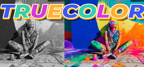
TRUECOLOR scored 73/100 on Steam Analyzer — Good for a Casual capsule. Top priority fix: [brand_consistency] Introduce a recurring visual motif or signature color accent that appears consistently across all store assets to build distinctive brand recognition.

Capsule scores by dimension

  • Genre Clarity: 7/10 — Walking simulator with color transformation hook. The split-screen before/after visual immediately communicates a color transformation mechanic, positioning this as a narrative-focused indie experience. At TINY size, the contrast between grayscale and vibrant color still reads clearly and signals a unique gameplay premise, though the walking simulator genre itself is not strongly conveyed by pose or environment alone.
  • Title Readability: 8/10 — Bold colorful title, readable at all sizes. TRUECOLOR uses a thick outlined sans-serif with rainbow letter coloring that stays legible from full header down to TINY thumbnail. The title placement at top center avoids noisy background and benefits from strategic color separation, though the layered outline effect adds visual interest without compromising clarity at small sizes.
  • Contrast & Color: 8/10 — Strong value separation with vibrant color palette. The left grayscale half and right saturated color half create excellent contrast against the dark Steam background. The vibrant neon pink, cyan, orange, and yellow in the right half pop distinctly, and even in grayscale test mode the tonal separation between subject and background holds. At TINY size the color burst still reads as a bright visual hook.
  • Uniqueness & Polish: 7/10 — Distinctive before-after concept with clean execution. The split-screen transformation narrative is a memorable visual hook that communicates the core mechanic—discovering color from monochrome—without needing text explanation. The execution is polished with consistent lighting and color grading across both halves, though the subject (seated figure with paint/objects) feels somewhat generic within indie casual game aesthetics and doesn't establish a strong unique character identity.
  • Brand Consistency: 6/10 — Coherent art direction, limited iconic identity. The before/after visual language and color palette are internally consistent and reinforce the game's core theme of color discovery. However, without additional reference to the 5 store screenshots, the capsule lacks a distinctive recurring motif or character that would make TRUECOLOR instantly recognizable on subsequent viewings—the concept is strong but the visual identity lacks a signature element.
  • Composition: 8/10 — Clear focal hierarchy with balanced split layout. The symmetrical split-screen design creates a strong visual hierarchy with the transformation concept at the center. The figure's pose and the paint/objects draw the eye naturally across both halves, and the layout resists cropping issues at small sizes since no critical elements hug the edges. The composition scales well from full header to TINY without losing the central contrast narrative.

What works

  • Immediate mechanic communication. The before-after split visual instantly communicates color discovery and transformation without requiring text, making the core premise crystal clear at all viewing sizes.
  • Strong title legibility. Thick outlined rainbow lettering remains readable at TINY size and benefits from placement on a controlled region rather than competing with background texture.
  • Excellent contrast against dark background. Vibrant color palette and grayscale separation create strong value contrast that stands out during quick scroll and maintains clarity in both color and grayscale tests.
  • Scalable composition design. Symmetrical split-screen layout avoids edge clipping issues and maintains focal clarity from full header down to thumbnail sizes.

What hurts the capsule

  • Generic subject matter. The seated figure with paint and objects is a common indie art trope that doesn't establish a distinctive character or visual hook unique to TRUECOLOR's brand identity.
  • Limited brand identity beyond concept. While the color-transformation mechanic is strong, the capsule lacks a recurring motif, signature palette, or iconic element that would make TRUECOLOR recognizable in isolation across multiple store assets.
  • Walking simulator genre not visually prominent. The seated pose and close-up framing don't strongly signal the walking simulator or exploration genre—the focus remains purely on color transformation at the expense of gameplay context.

Priority fixes

  1. [brand_consistency] Introduce a recurring visual motif or signature color accent that appears consistently across all store assets to build distinctive brand recognition.
  2. [genre_clarity] Incorporate subtle environmental context (horizon line, path, landscape element) that signals exploration or walking without losing the color transformation focal point.
  3. [uniqueness_polish] Develop a unique character or object silhouette that becomes the iconic face of TRUECOLOR, moving beyond generic figure + paint aesthetic.

Store copy priority fixes

  1. [hook_strength] Rewrite the short description to lead with the core action: 'Test your color memory by guessing forgotten hues in this meditative walking puzzle'—establish guessing as the primary mechanic upfront.
  2. [feature_communication] Replace the philosophical opening with a single clear sentence explaining the game loop: 'Walk through black-and-white scenes, guess the true colors of marked objects, and answer 10 in a row to escape.'
  3. [uniqueness] Add one sentence explaining why this game exists or what makes it different: 'Explores the gap between memory and perception through a simple, forgiving color-guessing mechanic' or similar differentiator.
  4. [tone_match] Consolidate the reflective tone throughout by moving the FAQ and AI disclosure to the bottom or a separate 'About' section, keeping the main copy focused on the meditative experience.

Related guides

Steam app ID: 4178670 · Tags: Casual, Walking Simulator, Singleplayer, Choices Matter, Third Person