Still, I am. scores 72/100 — better than 49% of 3D Platformer capsules (n=1,396).

Quick text summary

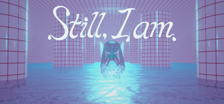
Still, I am. scored 72/100 on Steam Analyzer — Good for a 3D Platformer capsule. Top priority fix: [uniqueness_polish] Add a distinctive visual feature to the central figure—a recognizable shape, pose, accessory, or asymmetric element—that elevates it beyond a generic glowing humanoid and creates iconic brand recall.

Capsule scores by dimension

  • Genre Clarity: 7/10 — Atmospheric indie adventure clear. The ethereal blue-glowing figure in a minimalist grid environment signals a contemplative, experimental indie game rather than action-driven adventure. At tiny size, the glowing central silhouette and geometric setting remain readable and suggest a puzzle or narrative-focused experience. However, the abstract nature of the protagonist makes specific genre prediction difficult—it could be puzzle, exploration, or narrative-focused, leaving some ambiguity about the core gameplay loop.
  • Title Readability: 8/10 — Script title readable at all sizes. The white cursive text 'Still, I am.' is positioned in the upper-middle region with clear contrast against the purple gradient background. At small and tiny sizes, the text remains legible due to its generous size, white color, and consistent letter spacing. The elegant script font is thematic and maintains readability even under quick-scroll conditions, though the decorative nature means fine serifs become slightly fuzzy at the smallest sizes.
  • Contrast & Color: 8/10 — Strong neon glow separation. The cyan-turquoise glowing figure creates sharp value separation from the purple-pink gradient background, with the bright glow providing excellent silhouette clarity against the dark Steam background. The color palette uses complementary warm-cool contrast that reads cleanly in grayscale as well. At tiny size, the bright central element maintains distinct edges and pops effectively, though the grid floor detail becomes compressed and less distinguishable.
  • Uniqueness & Polish: 7/10 — Polished aesthetic with limited novelty. The vaporwave-inspired grid aesthetic with neon glow effects is visually cohesive and cleanly executed, showing intentional art direction and atmospheric lighting work. The translucent glowing figure ties thematically to the game's 'transparency' concept, demonstrating visual storytelling. However, the neon-grid aesthetic is relatively common in indie game marketing, and the figure itself lacks distinctive character design, placing it in the upper-mid range rather than truly standout territory.
  • Brand Consistency: 6/10 — Coherent but generic neon style. The purple-cyan neon grid environment is internally consistent with clean lighting, uniform grid geometry, and stable color palette throughout the visible composition. However, without reference to the 5 store screenshots, the visual identity lacks memorable iconography—no distinctive character, logo motif, or signature symbol that would enable recognition outside this context. The aesthetic is cohesive but archetypal enough that brand recall relies on the title rather than visual uniqueness.
  • Composition: 7/10 — Clear hierarchy with centered focus. The glowing figure is cleanly centered as the primary focal point with the title anchored at top-center, creating a strong vertical axis and clear visual hierarchy. The grid walls recede into depth, establishing foreground (figure), midground (grid floor), and background (walls), which aids quick parsing at small sizes. However, the perfectly centered composition feels static and slightly predictable, and at tiny size the grid floor detail becomes noise that dilutes the central focal strength.

What works

  • High contrast central glow. The bright cyan figure stands out sharply against the purple gradient and dark Steam background, ensuring visibility and visual pop during quick scrolling.
  • Legible title placement. The white script title 'Still, I am.' is positioned clearly above the figure with sufficient size and contrast to remain readable across all viewport sizes without competing with the focal point.
  • Thematic visual storytelling. The translucent glowing figure directly communicates the game's transparency concept, creating alignment between aesthetics and core mechanic.

What hurts the capsule

  • Generic neon-grid aesthetic. The vaporwave-inspired design is visually competent but archetypal within indie game marketing, reducing distinctiveness and brand memorability.
  • Static centered composition. The perfectly symmetric, dead-center focal point and title placement feels formulaic and lacks dynamic visual tension that would elevate polish perception.
  • Non-distinctive character silhouette. The glowing humanoid figure lacks specific character traits, costume detail, or recognizable design that would create an iconic brand symbol for later recognition.

Priority fixes

  1. [uniqueness_polish] Add a distinctive visual feature to the central figure—a recognizable shape, pose, accessory, or asymmetric element—that elevates it beyond a generic glowing humanoid and creates iconic brand recall.
  2. [composition] Introduce dynamic asymmetry to the layout—offset the title to an upper corner or shift the figure slightly off-center—to reduce the static centered feel and increase visual interest.
  3. [brand_consistency] Establish a signature motif or color accent within the neon palette that appears consistently across store assets, enabling visual recognition independent of the title.

Store copy priority fixes

  1. [hook_strength] Rewrite the short description to lead with a player-facing action and emotional outcome, e.g., 'Invisible. Unseen. Unstoppable—navigate a puzzle world where transparency is your superpower' or similar verb-driven hook.
  2. [feature_communication] Replace 'various gimmicks tied to transparency' with 2–3 concrete examples of puzzle types or obstacles (e.g., 'layered transparent platforms,' 'light-based reveal mechanics,' 'refraction puzzles').
  3. [audience_targeting] Add one sentence explicitly positioning the game: 'Perfect for players seeking a brief, meditative puzzle adventure' or 'Ideal for puzzle-platformer fans who enjoy elegant, concept-driven design.'

Related guides

Steam app ID: 4179080 · Tags: 3D Platformer, Puzzle Platformer, Puzzle, Platformer, 2.5D