Scoring genre clarity...

Xmas Survivors capsule

Xmas Survivors

A brutal pixel-art holiday survival shooter where Santa slaughters endless waves of enemies.

$3.997 user reviews
ActionAction RoguelikeArcade
Revulo GamesDec 17, 2025

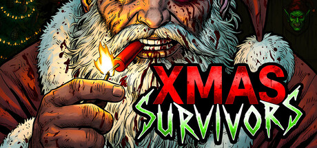
Xmas Survivors scores 80/100 — better than 91% of Action capsules (n=8,535).

7 user reviews · $3.99 · Released Dec 17, 2025 · By Revulo Games

Quick text summary

Xmas Survivors scored 80/100 on Steam Analyzer — Good for a Action capsule. Top priority fix: [composition] Add subtle foreground detail or silhouetted enemies in the lower half to create visual depth and fill the bottom void without cluttering the focal point.

Capsule scores by dimension

  • Genre Clarity: 8/10 — Holiday action shooter clearly conveyed. The corrupted Santa character holding a weapon with an aggressive expression immediately signals action-game intent, and the pixel-art style combined with harsh red title treatment communicates indie survival shooter energy. At TINY size, the white-bearded figure with aggressive pose and weapon still reads as action-oriented, though the specific 'survivors' mechanic is not visually obvious.
  • Title Readability: 9/10 — Bold red title pops at all sizes. XMAS in solid red caps with strong value contrast against the dark background remains crisp at TINY size, while SURVIVORS in lime green underneath maintains legibility through saturated color differentiation. The two-tier stacking creates clear hierarchy, and neither text layer breaks down during mental compression tests at small viewing sizes.
  • Contrast & Color: 9/10 — Excellent value separation throughout. The white beard, red title, and lime green subtitle create strong, layered contrast against the dark #1b2838 background, with the central Santa figure silhouette clearly separated from the warmer brown coat tones. Grayscale mental test confirms the white facial hair and red text maintain distinct value separation, ensuring the design does not collapse into mud at thumbnail size.
  • Uniqueness & Polish: 8/10 — Distinctive holiday horror twist. The subversion of wholesome Santa into a brutal violence perpetrator is a memorable hook that differentiates this from generic survival shooters, reinforced by the hand-drawn pixel-art character with genuine menace in the expression. The craft shows intentional art direction—deliberate character design and thoughtful color palette—rather than template assembly, though the overall composition feels slightly portrait-focused without additional environmental storytelling.
  • Brand Consistency: 7/10 — Coherent dark holiday brand voice. The corrupted Santa character, warm brown and red color palette, and pixel-art rendering style create internal consistency and an identifiable visual brand that could be recognized across marketing materials. The lime-green horror-movie title treatment (evoking films like Alien) signals a specific tonal brand, though without access to the full visual identity system, it is difficult to assess whether this matches established icon or character motifs across store screenshots.
  • Composition: 7/10 — Centered focus with safe title placement. The Santa character occupies clear center-focal-point space, drawing the eye immediately, while the two-line title sits in the upper-right quadrant where Steam typically expects it, maintaining safe margins from edges. At SMALL and TINY sizes, the composition holds because the figure remains the primary anchor and text does not collide with character elements, though the lower third feels slightly empty and the composition could benefit from subtle background detail to fill visual weight.

What works

  • Title legibility at all sizes. Red and lime-green text with strong value contrast against dark background remains readable at TINY thumbnail size without loss of impact.
  • Clear genre and tone communication. Aggressive Santa with weapon and dark art direction immediately signal action-horror rather than wholesome holiday content.
  • Distinctive visual hook. The subverted Santa concept stands out in the survival-shooter space and feels intentional rather than generic.
  • Strong silhouette definition. White beard, dark coat, and central figure create clear separation from background in grayscale, ensuring read at compressed sizes.

What hurts the capsule

  • Lower composition balance. The bottom third of the capsule is largely empty space, creating uneven weight distribution and wasting prime real estate.
  • Minimal environmental context. Beyond the Santa character, there is no environmental or mechanical storytelling—no weapon detail, victim, or gameplay hint beyond the title.
  • Generic background texture. The dark, warm-toned background feels atmospheric but does not reinforce the specific 'survivors' or 'waves' mechanic visually.

Priority fixes

  1. [composition] Add subtle foreground detail or silhouetted enemies in the lower half to create visual depth and fill the bottom void without cluttering the focal point.
  2. [genre_clarity] Introduce a small visual cue—such as enemy shapes, crosshair UI, or wave indicator—to reinforce the 'survivors' wave-based mechanic beyond the title alone.
  3. [uniqueness_polish] Consider adding a faint environmental element (snowy setting, destroyed Christmas decor, or carnage hint) to strengthen the dark-holiday narrative beyond Santa's expression.

Store copy priority fixes

  1. [feature_communication] Add a line specifying average run length (e.g., '15-30 minute runs') and whether progression has an end-state or infinite scaling to clarify time commitment expectations.
  2. [audience_targeting] Include a brief difficulty or accessibility statement (e.g., 'Unforgiving arcade action—not recommended for casual players' or 'Adjustable difficulty available') to calibrate player expectations and reduce refunds.
  3. [genre_clarity] Explicitly mention 'roguelike' or 'roguelite' progression mechanics in the short description to align genre labels with copy and signal the metagame loop.

Related guides

Steam app ID: 4184540 · Tags: Action, Action Roguelike, Arcade, Arena Shooter, Gore