Scoring genre clarity...

Let Him Bake capsule

Let Him Bake

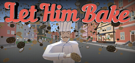
Dash through a colorful, low-poly world, dodge obstacles, and collect ingredients to bake as many cookies as you can! Sell your baked goods to upgrade your speed, collection, and baking power. Procedurally generated runs and escalating difficulty keep every attempt fresh.

$2.995 user reviews
CasualActionAction Roguelike
CHRISTO2KDec 22, 2025

Let Him Bake scores 73/100 — better than 54% of Casual capsules (n=10,153).

5 user reviews · $2.99 · Released Dec 22, 2025 · By CHRISTO2K

Quick text summary

Let Him Bake scored 73/100 on Steam Analyzer — Good for a Casual capsule. Top priority fix: [brand_consistency] Introduce a signature character design element or iconic logo symbol that appears consistently across store assets to build immediate brand recall.

Capsule scores by dimension

  • Genre Clarity: 7/10 — Casual action with cooking theme clear. The low-poly chef character center-stage with falling ingredients and a vibrant street bakery setting immediately communicates a casual, lighthearted cooking or baking game. At TINY size, the silhouette of the chef and overhead ingredient rain remain readable, though the specific 'dash and collect' action loop is less obvious without text. The whimsical visual tone and colorful asset placement strongly suggest indie casual gameplay rather than serious action.
  • Title Readability: 8/10 — Bold, legible orange script title. The title 'Let Him Bake' uses a thick, warm orange script font with a clear outline that stands out against the mid-tone blue sky background. At SMALL size (231×87), the letterforms remain distinct and readable; at TINY size (120×45), the title compresses but the bold weight and color separation still allow recognition. The placement in the upper portion avoids heavy texture and maintains clear contrast throughout all zoom levels.
  • Contrast & Color: 8/10 — Strong warm-cool value separation. The vibrant orange title and warm red-brown bakery storefront create excellent value contrast against the cool blue-gray sky and street environment. The low-poly chef in white and pastels pops cleanly from the background, and the falling cookie and ingredient assets have crisp silhouettes in grayscale. At TINY size, the warm-cool split remains effective and the focal subject maintains clear separation without muddy mid-tones.
  • Uniqueness & Polish: 7/10 — Charming low-poly aesthetic, competent execution. The low-poly art style, whimsical chef character, and procedurally-hinted ingredient rain create a distinctive indie vibe that avoids generic AAA action tropes. The craft is solid—clean geometry, intentional color choices, and a coherent playful tone—but the concept (baking/collecting casual game) is not entirely novel within the indie space. The visual storytelling clearly communicates 'fun, relaxed baking adventure' without confusion, positioning it well above generic but not reaching premium standout status.
  • Brand Consistency: 6/10 — Consistent art style, limited iconic motif. The low-poly rendering, warm color palette, and whimsical tone are internally cohesive across the visible scene, suggesting reliable visual identity from the store screenshots. However, there are no immediately iconic character quirks, signature symbols, or distinctive brand markers that would make 'Let Him Bake' instantly recognizable in isolation. The chef and bakery setting are pleasant but not uniquely branded—another low-poly casual game could adopt similar visual language without confusion risk.
  • Composition: 8/10 — Clear focal hierarchy, balanced depth layering. The white chef figure dominates the center-foreground, drawing immediate attention, while the bakery storefront and street recede in the midground and background, creating strong depth layering. The falling ingredients act as secondary guides without overwhelming the primary subject. At SMALL and TINY sizes, the focal point remains clear and the composition resists clutter; title placement at top-left of frame avoids edge-crop risk and maintains readable safe margins.

What works

  • Bold, readable orange title. The thick script font with clear outline remains legible and pops against background from full header through tiny thumbnail sizes.
  • Strong warm-cool color harmony. Orange and red bakery elements contrast effectively against cool blue-gray sky and street, maintaining silhouette clarity even in grayscale.
  • Clear focal hierarchy with depth. The central white chef and foreground ingredients guide attention immediately, with background bakery and street providing context without competing.
  • Whimsical, cohesive low-poly aesthetic. The charming art style and playful tone consistently communicate indie casual game identity without genre confusion.

What hurts the capsule

  • Limited brand distinctiveness. The chef and bakery setting, while pleasant, lack iconic visual markers that would make the game instantly recognizable versus other low-poly casual games.
  • Ingredient details lose impact at tiny size. The overhead falling cookies and ingredient assets, while visually appealing at full header, become generic shapes at 120×45 resolution and add less informational value.
  • Generic casual game framework. The core concept (collect ingredients, bake, upgrade, repeat) is executed well but not novel; visual storytelling does not highlight a unique mechanic or hook that stands out from peers.

Priority fixes

  1. [brand_consistency] Introduce a signature character design element or iconic logo symbol that appears consistently across store assets to build immediate brand recall.
  2. [uniqueness_polish] Consider adding a subtle visual cue or UI element that hints at the core 'dash and dodge' action loop, differentiating it from static baking simulators.
  3. [composition] Ensure ingredient assets have enough visual weight and variety that they remain interesting and readable at small sizes, not just decorative noise.

Store copy priority fixes

  1. [uniqueness] Strengthen the baking-and-café return loop as a core differentiator—explain how it diverges from standard roguelike progression and why it creates a unique gameplay rhythm.
  2. [feature_communication] Reduce emoji density by 50%; replace formatting emoji with clean bullet points or inline formatting to improve scannability and professional presentation.
  3. [hook_strength] Open the short description with a more distinctive hook: swap 'Dash through a colorful, low-poly world' for a punchier value statement like 'Bake your way to dominance in this arcade runner where every cookie fuels your power.'
  4. [feature_communication] Replace or explain the '[Redacted]' mystery upgrade with a real fifth upgrade or remove it; incomplete information creates doubt rather than intrigue on a store page.

Related guides

Steam app ID: 4184580 · Tags: Casual, Action, Action Roguelike, Arcade, Roguelike