Scoring genre clarity...
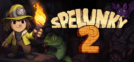
Spelunky 2 capsule

Spelunky 2

Spelunky 2 builds upon the unique, randomized challenges that made the original a roguelike classic, offering a huge adventure designed to satisfy players old and new. Meet the next generation of explorers as they find themselves on the Moon, searching for treasure and missing family.

$19.99Very Positive(102)
Platformer2D PlatformerDifficult
Mossmouth, BlitWorksSep 29, 2020

Spelunky 2 scores 88/100 — better than 99% of Platformer capsules (n=2,524).

Very Positive (102 reviews) · $19.99 · Released Sep 29, 2020 · By Mossmouth

Quick text summary

Spelunky 2 scored 88/100 on Steam Analyzer — Excellent for a Platformer capsule. Top priority fix: [contrast_color] Increase purple bat saturation or add a subtle outline to ensure equal silhouette separation from background creatures at tiny sizes.

Capsule scores by dimension

  • Genre Clarity: 9/10 — Mining adventure roguelike immediately clear. The capsule communicates roguelike action-adventure through multiple genre-specific cues: a spelunker with mining helmet and torch, a green frog enemy, a purple bat creature, and the number 2 in brick/stone texture suggesting dungeon exploration. At tiny size, the character silhouette, torch light, and enemies remain instantly readable and genre-defining, making it impossible to mistake this for anything but a cave-diving action game.
  • Title Readability: 9/10 — Bold yellow title remains legible tiny. SPELUNKY 2 uses a large, high-contrast bright yellow serif font positioned prominently in the upper-right area with no background clutter behind it. The letterforms maintain excellent clarity even at tiny thumbnail size, and the iconic number 2 in burnt orange brick texture integrates seamlessly with the title without reducing legibility.
  • Contrast & Color: 9/10 — Warm glow punches against dark background. The warm yellow/orange palette of the torch light, title, and brick number creates strong luminous separation from the dark blue-black background. The character's light-colored clothing, green frog, and purple bat all maintain distinct silhouettes in grayscale, with the bright torch glow acting as a secondary focal point that guides attention and enhances discoverability at small sizes.
  • Uniqueness & Polish: 8/10 — Distinctive art style with character charm. Spelunky 2's charming hand-drawn art direction is instantly recognizable, with the cheerful protagonist design, expressive character animation, and carefully crafted enemy sprites demonstrating high craft polish. The visual storytelling hints at the core loop (treasure hunting, enemy encounters, dungeon navigation) without feeling generic, and the cohesive cartoon aesthetic sets it apart from darker action-adventure competitors in the benchmark list.
  • Brand Consistency: 9/10 — Iconic character and visual identity strong. The spelunker protagonist, signature yellow mining outfit, torch mechanic, and distinctive art style are core brand pillars visible here that would be immediately recognizable to franchise fans. The consistent palette, character proportions, and enemy designs (frog, bat) reinforce a coherent visual identity that aligns with Spelunky's established aesthetic across multiple titles and marketing materials.
  • Composition: 9/10 — Balanced focal hierarchy with clear staging. The character on the left with bright torch forms the primary focal point, the enemies in the center-right provide mid-ground interest, and the large title anchors the upper portion without overwhelming. The layout uses clear depth layering with foreground character, midground creatures, and dark background, leaving safe margins around edges and maintaining excellent readability across all three sizes (full, small, tiny).

What works

  • Torch glow creates luminous focal point. The bright yellow-orange flame light draws the eye immediately and creates strong warm-to-cool contrast against the dark background, enhancing visual hierarchy and discoverability in quick scrolls.
  • Character and enemies silhouettes remain clear at tiny size. The protagonist, frog, and bat all maintain distinct readable shapes even in thumbnail view due to consistent outline work and value separation from the background.
  • Title position avoids clutter and maintains spacing. SPELUNKY 2 occupies prime real estate in the upper half without sitting directly over noisy background elements, and the brick-textured number integrates naturally into the composition rather than feeling plastered on.
  • Art style communicates premium indie polish. The hand-drawn aesthetic and attention to character detail convey intentional craft and distinguish Spelunky 2 from generic action-adventure templates common in the genre.

What hurts the capsule

  • Dark background leaves some mid-tone visual space underutilized. While contrast is strong, the large dark area in the upper-left corner and between elements could potentially benefit from subtle background detail or gradient to increase visual richness without losing clarity.
  • Purple bat creature has lower contrast than other elements. The purple bat on the far right blends slightly more into the dark background compared to the green frog and bright character, reducing its secondary focal point impact at very small sizes.

Priority fixes

  1. [contrast_color] Increase purple bat saturation or add a subtle outline to ensure equal silhouette separation from background creatures at tiny sizes.
  2. [composition] Consider adding a subtle directional light or shadow detail to the dark upper-left background area to enhance overall visual depth without compromising title readability.

Store copy priority fixes

  1. [feature_communication] Rewrite the opening of the detailed description to replace the repetitive 'meet the next generation' sentences with a feature-forward hook: e.g., 'Spelunky 2 returns with multi-layer exploration, rideable mounts, dynamic liquid physics, and a persistent Base Camp community that evolves with every run.'
  2. [uniqueness] Add a differentiating statement after the first paragraph that highlights what sets Spelunky 2 apart from other roguelikes: 'Unlike other procedural platformers, Spelunky 2's world is deeply reactive—your interactions with NPCs, mounts, and dynamic systems create emergent stories that change every playthrough.'
  3. [genre_clarity] Insert a single sentence in the short description that explicitly names 'perma-death' or 'permadeath' to signal to hardcore roguelike fans that this is a true roguelike, not a casual platformer with roguelike elements.

Related guides

Steam app ID: 418530 · Tags: Platformer, 2D Platformer, Difficult, Online Co-Op, Perma Death