THE SILENT BUNKER SCREAMING ECHOES scores 70/100 — better than 33% of Adventure capsules (n=7,922).

Quick text summary

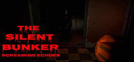
THE SILENT BUNKER SCREAMING ECHOES scored 70/100 on Steam Analyzer — Good for a Adventure capsule. Top priority fix: [uniqueness_polish] Add a distinctive visual element—such as a silhouette pose suggesting the protagonist searching, a puzzle detail, or a signature color accent—to differentiate the brand from generic horror capsules.

Capsule scores by dimension

  • Genre Clarity: 7/10 — Horror puzzle game clearly signaled. The dark bunker interior, ominous silhouette in doorway, and orange spherical object (suggesting danger or warning) immediately communicate a survival-horror or dark puzzle game. At TINY size, the silhouette and warm glow still read as eerie and confined, establishing tension. Genre intent is clear but could be stronger with more specific mechanic hints.
  • Title Readability: 8/10 — Bold red title stands out well. The large red block-letter title 'THE SILENT BUNKER' contrasts sharply against the dark background and remains readable at SMALL and TINY sizes due to high value separation and clean letterforms. 'SCREAMING ECHOES' tagline below is smaller and readable but less prominent. At TINY size the main title still registers clearly as the primary text element.
  • Contrast & Color: 8/10 — Strong red against dark background. Bright red title pops decisively against #1b2838-equivalent darkness, with the orange glow on the right adding warm accent contrast. The dark bunker interior and silhouette create clear value separation. In grayscale, the red and orange elements maintain distinct brightness, and the silhouette reads as a clear dark shape against mid-tone background walls.
  • Uniqueness & Polish: 6/10 — Competent but familiar horror setup. The bunker interior with ominous silhouette and warning glow is a recognizable horror-game aesthetic, but lacks a distinctive visual hook or unique art style that sets it apart from other indie horror titles. Rendering is clean and intentional, but the composition feels like a standard locked-down horror scene rather than something with a memorable signature look or mechanic reveal.
  • Brand Consistency: 6/10 — Dark horror identity present but generic. The capsule communicates a dark, tense survival-horror brand through consistent use of limited warm-and-dark palette, dim interior setting, and ominous staging. However, there are no distinctive character, motif, or icon cues visible that would make this recognizable as *this specific game* later. The identity is genre-appropriate but not uniquely memorable.
  • Composition: 7/10 — Clear focal hierarchy with good depth. The title occupies the strong upper-left to center zone, the ominous silhouette centers mid-frame, and the orange glow adds depth on the right. At SMALL and TINY sizes, the red title dominates and the silhouette remains a clear secondary focus point. Layout avoids scatter, but the composition relies heavily on recognizable genre staging rather than innovative spatial design.

What works

  • High-contrast red title. Bold letterforms and strong red-on-dark value separation ensure the title remains legible and eye-catching at all sizes, even in quick scroll.
  • Clear horror-game intent. Bunker interior, silhouette, and orange danger glow immediately communicate genre and mood without ambiguity.
  • Readable tagline integration. 'SCREAMING ECHOES' adds thematic depth and remains readable at SMALL size without cluttering the layout.

What hurts the capsule

  • Generic horror aesthetic. The silhouette, bunker interior, and glow setup rely on familiar horror-game tropes without a distinctive visual signature or unique art style.
  • No memorable brand icon or motif. The capsule lacks a character, symbol, or signature element that would make the game instantly recognizable on future viewing.
  • Limited visual storytelling. The capsule does not hint at the core mechanic (puzzle-solving, search, survival) or the emotional hook (missing brother) beyond the generic horror mood.

Priority fixes

  1. [uniqueness_polish] Add a distinctive visual element—such as a silhouette pose suggesting the protagonist searching, a puzzle detail, or a signature color accent—to differentiate the brand from generic horror capsules.
  2. [genre_clarity] Introduce a subtle gameplay hint, such as a puzzle mechanism, search clue, or hazard detail, to reinforce that this is a puzzle-adventure-horror hybrid, not pure action-horror.
  3. [brand_consistency] Develop a recognizable icon or character detail from the 7 store screenshots and feature it prominently to build a memorable identity beyond the bunker setting.

Store copy priority fixes

  1. [feature_communication] Add concrete puzzle examples: replace "challenging puzzles test observation, logic, and patience" with specific puzzle types (e.g., 'cipher locks, environmental pattern-matching, object assembly') to clarify gameplay loops.
  2. [uniqueness] Insert a differentiator sentence before the atmosphere paragraph: identify one mechanic or narrative element that is unique to this bunker (e.g., 'the bunker's layout shifts based on your choices' or 'paranormal investigator protocols unlock new story branches') to separate this from generic horror games.
  3. [audience_targeting] Add a sentence about difficulty and playtime expectation: e.g., 'Designed for players seeking a 3-4 hour psychological slow-burn rather than action-driven scares' to help the right audience self-identify.
  4. [feature_communication] Clarify the interaction model: add one sentence explaining whether players collect items, solve environmental puzzles, or trigger events through exploration, so players understand their core activity loop.

Related guides

Steam app ID: 4185310 · Tags: Adventure, Action-Adventure, Puzzle, Walking Simulator, Exploration