Scoring genre clarity...
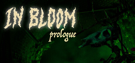
In Bloom is a survival-horror game where you awaken alone in a world overtaken by nature. Guided by a mysterious voice on a radio, you must solve puzzles, survive the dangers around you, and reach Safe Haven before the wilderness consumes you.
Free to PlayPositive(23)
ActionPost-apocalypticSurvival Horror
Team BloomDec 12, 2025