Scoring genre clarity...
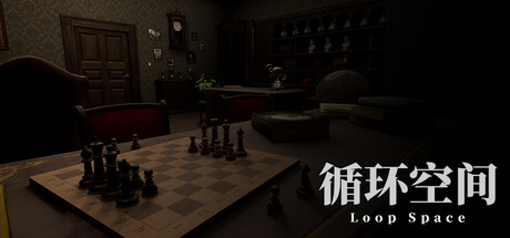
Enter the patient's inner world. Seek out the abnormal, uncover the truth. You will step into the patient's mental world, explore their psyche, and search for anomalies and fragmented memories. Every wrong choice will send you back to the beginning—can you reach the eighth level?
$3.991 user reviews
First-PersonHorrorPsychological Horror
XUZHIHAOApr 21, 2026