Flip Hammy scores 73/100 — better than 54% of Casual capsules (n=10,153).

Quick text summary

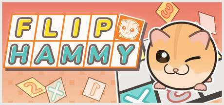
Flip Hammy scored 73/100 on Steam Analyzer — Good for a Casual capsule. Top priority fix: [genre_clarity] Incorporate a visual hint of the 'flip' mechanic—e.g., show the hamster in two face states side-by-side or add a rotation/flip arrow to suggest the core gameplay.

Capsule scores by dimension

  • Genre Clarity: 7/10 — Casual puzzle with clear protagonist. The cute hamster character and blocky puzzle tiles immediately signal a casual indie puzzle game. The playful art style and simplified geometric shapes communicate accessibility and a light-hearted tone. At TINY size, the character silhouette and tile elements remain readable, though the specific puzzle mechanic (face-flipping) is not obvious from visuals alone.
  • Title Readability: 8/10 — Bold, colorful, highly legible. FLIP HAMMY uses bright primary colors (yellow, blue, red) with white outlines on a warm coral background, creating strong contrast and clarity. The text remains readable at SMALL and TINY sizes due to chunky letterforms and generous letter spacing. The title placement in the upper left avoids the character and maintains clean separation from background clutter.
  • Contrast & Color: 8/10 — Warm palette pops against dark Steam bg. The warm coral-orange background, combined with yellow and turquoise accents, creates strong value separation from the dark #1b2838 Steam background. The character's peachy skin tone and the blue-cyan tiles create clear silhouettes even at TINY size. The white outlines around text and character edges enhance readability in grayscale.
  • Uniqueness & Polish: 7/10 — Charming character-driven presentation. The cute, expressive hamster with a winking face is the standout visual hook that signals personality and charm, differentiating it from generic puzzle templates. The hand-drawn aesthetic and playful floating tile elements show intentional craft. However, the overall composition feels somewhat standard for casual indie games—the core visual identity relies heavily on the character rather than a mechanically distinctive visual metaphor.
  • Brand Consistency: 7/10 — Cohesive art style, recognizable mascot. The warm color palette (coral, peachy tones, turquoise accents) is applied consistently across the title, character, and tile elements. The hamster's simple, friendly expression and geometric construction style create an identifiable character that could serve as a brand anchor. The overall illustration style is uniform and polished, supporting internal coherence.
  • Composition: 7/10 — Clear hierarchy, balanced layout. The title anchors the top left, the character occupies the right half as the primary focal point, and scattered tile elements fill supporting space without overwhelming. The layout reads well at SMALL size with clear separation between text and character. At TINY size, the composition remains legible, though some floating tiles become less distinct; the character and title remain the dominant read.

What works

  • Vibrant, high-contrast color palette. Warm coral, yellow, and turquoise pop strongly against Steam's dark background and maintain clarity even at tiny thumbnail size.
  • Charming, expressive character mascot. The winking hamster face communicates personality and memorability, serving as a clear brand anchor that differentiates from generic puzzle games.
  • Bold, readable typography. White-outlined text in primary colors ensures the title remains fully legible at all sizes without relying on background clarity.

What hurts the capsule

  • Mechanical uniqueness not communicated visually. The 'flip face' core mechanic is not visually evident from the capsule—it reads as a standard puzzle game with a cute character rather than something mechanically distinctive.
  • Floating tiles lack clear hierarchy. The scattered geometric shapes feel decorative rather than purposeful; at TINY size they become visual noise without adding gameplay context.
  • Generic puzzle aesthetic despite strong character. While the hamster is appealing, the overall composition and tile treatment align with common casual game templates, limiting visual distinctiveness in a crowded genre.

Priority fixes

  1. [genre_clarity] Incorporate a visual hint of the 'flip' mechanic—e.g., show the hamster in two face states side-by-side or add a rotation/flip arrow to suggest the core gameplay.
  2. [uniqueness_polish] Replace scattered decorative tiles with a more intentional composition that hints at puzzle progression or the specific flip mechanic, elevating visual storytelling.
  3. [composition] Ensure floating tile elements are fewer and positioned to guide eye movement toward the character, reducing visual scatter and improving focus at small sizes.

Store copy priority fixes

  1. [hook_strength] Rewrite the short description to lead with the flip mechanic's emotional payoff: 'Flip between two puzzle worlds to outsmart obstacles and unlock secret Hammy variants' instead of 'Let's clear simple rules puzzles.'
  2. [tone_match] Proofread and correct all grammatical errors: change 'There're' to 'There are,' 'version of Hammy' to 'versions of Hammy,' and rephrase 'Wanna pass' as 'Need to pass.' to maintain a polished, family-friendly voice.
  3. [uniqueness] Add a sentence explaining how the flip mechanic creates puzzle complexity beyond standard grid-puzzlers: 'Navigate two interlocking puzzle faces where the solution on one side might block your path on the other—solve by switching at the right moment.'
  4. [feature_communication] Clarify the progression system: explain how many stages unlock the 'input swapped gimmick' and what 'input swapped' means in practical terms (e.g., reversed controls, inverted movement).

Related guides

Steam app ID: 4190050 · Tags: Casual, Indie, Puzzle, 2D, Cute