Scoring genre clarity...
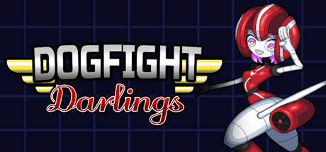
Dogfight Darlings is a bite-sized, bullet hell boss rush featuring an aviation themed cast of plane girls! Take to the skies, unlock skills, and battle your way to victory through daring aerial combat in this game made entirely of boss fights.
$2.996 user reviews
Bullet HellBoss RushPixel Graphics
dull ratMar 9, 2026