Scoring genre clarity...
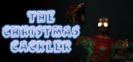
The Christmas Cackler is a first-person Christmas-themed Comedic Horror game where you play as little Jimmy, lying in bed on the night before Christmas, trying to finish drawing his mother's present and avoid getting grabbed by the Christmas Cackler!
$2.49Positive(49)
ComedyHorrorDark Comedy
MyGrandfather GamesDec 15, 2025