Scoring genre clarity...
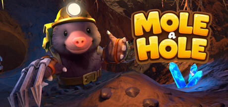
In Mole a Hole, you become a determined mole on a mission to dig deeper than ever before. Excavate tunnels, collect valuable items, upgrade your equipment, and explore a playful underground full of surprises, challenges, and rewarding discoveries - perfect for immersive VR fun.
$6.996 user reviews
VRSandboxMining
Wenkly StudioJan 24, 2026