Scoring genre clarity...

Rock Paper Scissors: The Roguelike Puzzle Game capsule

Rock Paper Scissors: The Roguelike Puzzle Game

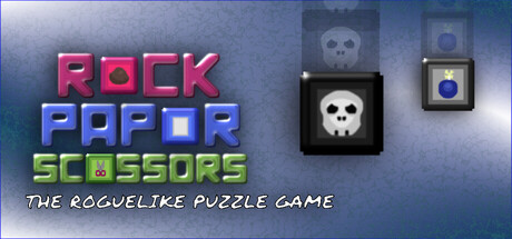
The Roguelike Puzzle game where you play Rock Paper Scissors and smash high scores with a variety of flavored blocks. Buy and equip power blocks to help you increase your score and get to the next round. Watch out for hazard blocks that may deter your progress and end your run.

$2.991 user reviews
RoguelitePuzzleTutorial
LunarCore GamesDec 23, 2025

Rock Paper Scissors: The Roguelike Puzzle Game scores 68/100 — better than 15% of Roguelite capsules (n=2,290).

1 user reviews · $2.99 · Released Dec 23, 2025 · By LunarCore Games

Quick text summary

Rock Paper Scissors: The Roguelike Puzzle Game scored 68/100 on Steam Analyzer — Solid for a Roguelite capsule. Top priority fix: [uniqueness_polish] Develop a distinctive visual hook or iconic character element (mascot, unique art style signature, or visual mechanic indicator) that differentiates from standard indie puzzle templates and makes the capsule memorable against Balatro and similar peers

Capsule scores by dimension

  • Genre Clarity: 7/10 — Puzzle roguelike identity clear. The pixelated block imagery and skull/hazard icons immediately signal a puzzle game with roguelike progression. The title explicitly states 'PUZZLE GAME' and the tagline confirms roguelike mechanics. At tiny size, the colorful blocks and iconic skull remain recognizable, though the specific rock-paper-scissors mechanic is not visually obvious without text.
  • Title Readability: 8/10 — Bold text prominent at small sizes. The main title 'ROCK PAPER SCISSORS' uses bright neon colors (pink, blue, yellow-green) with thick, blocky letterforms that maintain legibility down to small capsule size. The tagline 'THE ROGUELIKE PUZZLE GAME' is readable at full size but becomes marginal at tiny size due to italic script font and smaller point size. Contrast against the blue gradient background is strong and supports quick recognition.
  • Contrast & Color: 7/10 — Good separation with neon pop. The bright neon title colors (saturated pink, cyan, lime) create strong value and hue contrast against the cool blue-gray background, popping well in quick scroll. The skull and block icons in the background read clearly in white and dark tones. However, the mid-tone blue gradient background slightly mutes the overall punch, and the tagline has less separation from the background than the primary title.
  • Uniqueness & Polish: 6/10 — Competent indie aesthetic, generic execution. The pixel-art blocks and neon title treatment fit indie puzzle game conventions but feel more template-like than distinctive. The composition is functional and clean, but lacks a memorable visual hook or unique art direction beyond applying common indie styling to a standard layout. The design communicates the game clearly but does not stand out against peers like Balatro or Buckshot Roulette which have more distinctive visual identities.
  • Brand Consistency: 6/10 — Simple palette with limited identity cues. The neon pink-blue-green color scheme is consistent across the title and icon elements, and the pixelated art style is coherent throughout. However, there are no iconic characters, signature motifs, or memorable brand symbols that would enable recognition in isolation. The palette is generic for indie puzzle games and does not create a distinctive brand signature that would carry across marketing materials or community recognition.
  • Composition: 7/10 — Clear hierarchy with balanced layout. The bold title dominates the left-center foreground with strong visual weight, while the hazard/block icons occupy the upper right, creating a clear hierarchy and avoiding clutter. The layout respects safe margins and the focal point remains on the title text across all sizes. At tiny size, the composition compresses well and the title remains the primary read; however, the background icons become abstract noise that adds little value at small scale.

What works

  • Legible neon title at small sizes. Thick, blocky letterforms in bright pink, cyan, and yellow-green maintain strong readability from full header down to small capsule size against the cool blue background.
  • Clear genre signaling with blocks and skulls. Pixelated block imagery and skull icons immediately communicate puzzle and roguelike themes without requiring text interpretation.
  • Strong value contrast for quick recognition. Neon colors and white/dark icon tones create clear silhouettes and separation from the blue-gray background in quick scroll conditions.

What hurts the capsule

  • Generic indie puzzle aesthetic. The pixel-art and neon treatment apply common indie conventions without distinctive visual hooks, making the capsule feel template-like rather than memorable.
  • Tagline readability degrades at tiny size. The italic script tagline becomes difficult to parse at thumbnail size and adds minimal value to the core communication.
  • No iconic character or brand motif. Background icons are functional but lack a recognizable mascot or signature visual element that could build brand identity across multiple touchpoints.

Priority fixes

  1. [uniqueness_polish] Develop a distinctive visual hook or iconic character element (mascot, unique art style signature, or visual mechanic indicator) that differentiates from standard indie puzzle templates and makes the capsule memorable against Balatro and similar peers
  2. [brand_consistency] Create a recognizable brand symbol or signature element that could appear across store screenshots and marketing materials to build cohesive identity and community recognition
  3. [title_readability] Remove or simplify the italic tagline at small sizes, or rephrase it in sans-serif font that maintains legibility at thumbnail scale without sacrificing information

Store copy priority fixes

  1. [hook_strength] Replace the short description's opening with a concrete gameplay verb and emotional outcome: e.g., 'Master the hidden strategy of Rock Paper Scissors to chain devastating block combos and outscore increasingly brutal roguelike runs.' This creates immediate intrigue and urgency.
  2. [feature_communication] Add a bulleted or concise feature breakdown after the first paragraph listing: Core Mechanic (RPS block placement), Shop/Progression, Stat Boosts, Hazards, and RPS Minigames—separating mechanics from narrative so a skimmer can grasp the full loop in 10 seconds.
  3. [uniqueness] Explain what makes RPS distinct in a puzzle context: e.g., 'Unlike traditional match-3, every block placement is a strategic choice—use Paper to counter Rock threats, or Scissors to cut through Paper chains'—this shows mechanical depth not generic roguelike polish.
  4. [audience_targeting] Clarify the intended difficulty curve and playstyle: e.g., 'Master challenging roguelike runs on your own schedule with full controller support and no time pressure' disambiguates between 'Difficult' and 'Relaxing' tags by targeting asynchronous, strategic play, not twitch reflex.

Related guides

Steam app ID: 4199400 · Tags: Roguelite, Puzzle, Tutorial, Difficult, Roguelike